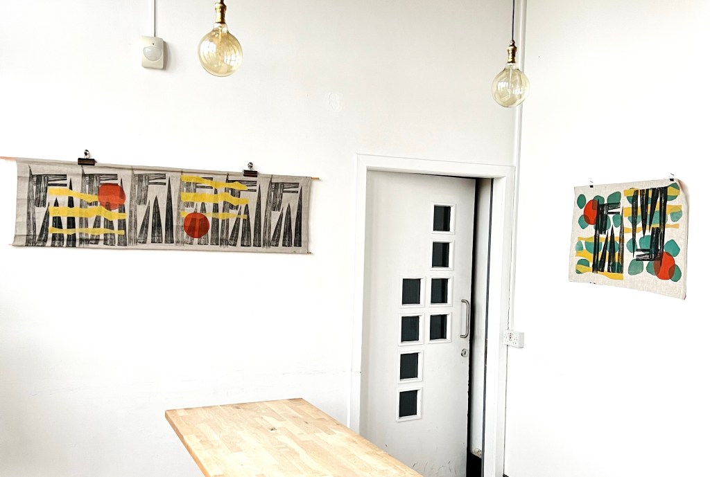
Another great annual open doors day at Fire Station Creative. Managed to show some new screen print work alongside all my ceramics:
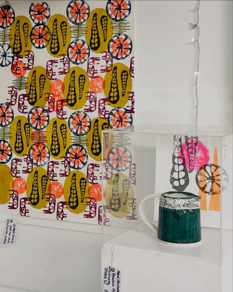
Another great annual open doors day at Fire Station Creative. Managed to show some new screen print work alongside all my ceramics:
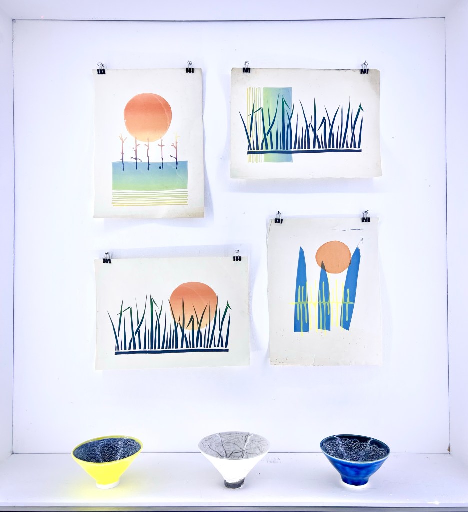

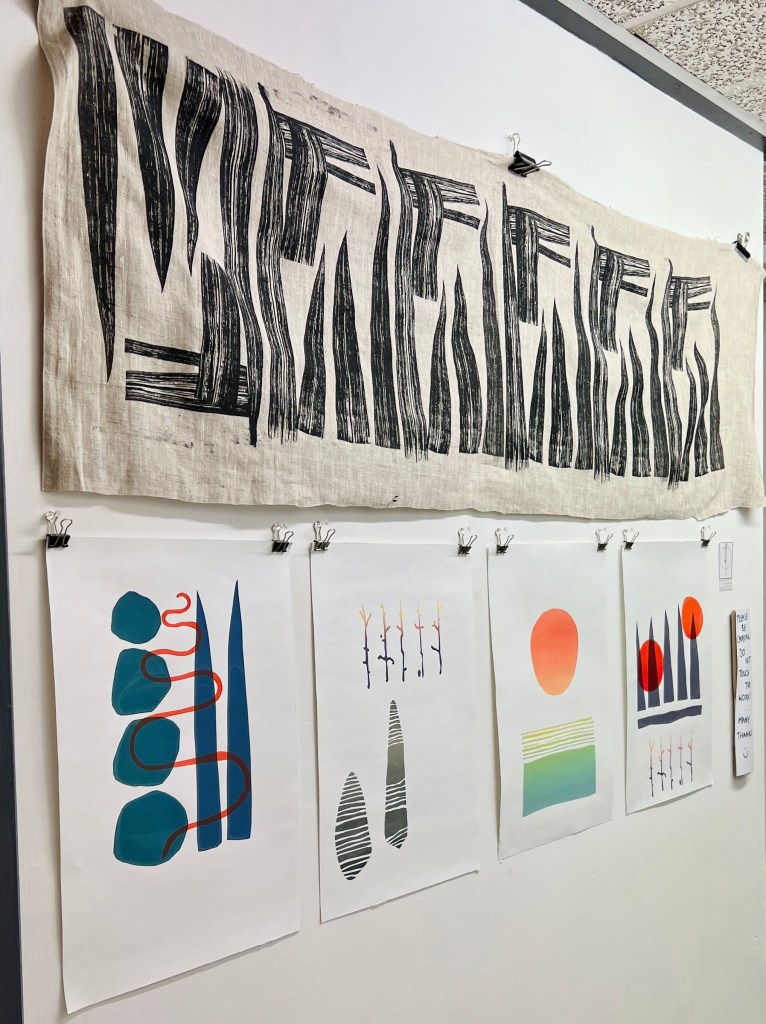
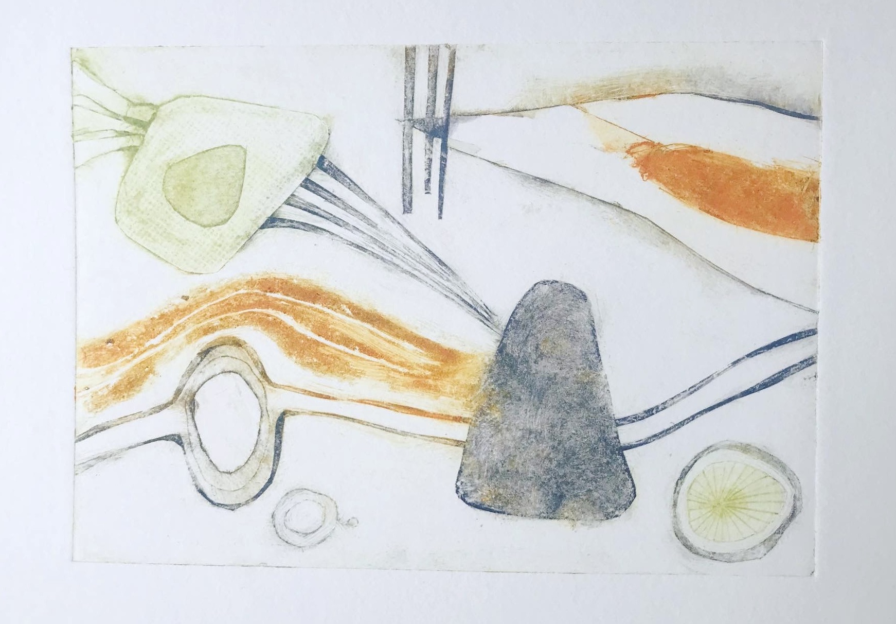
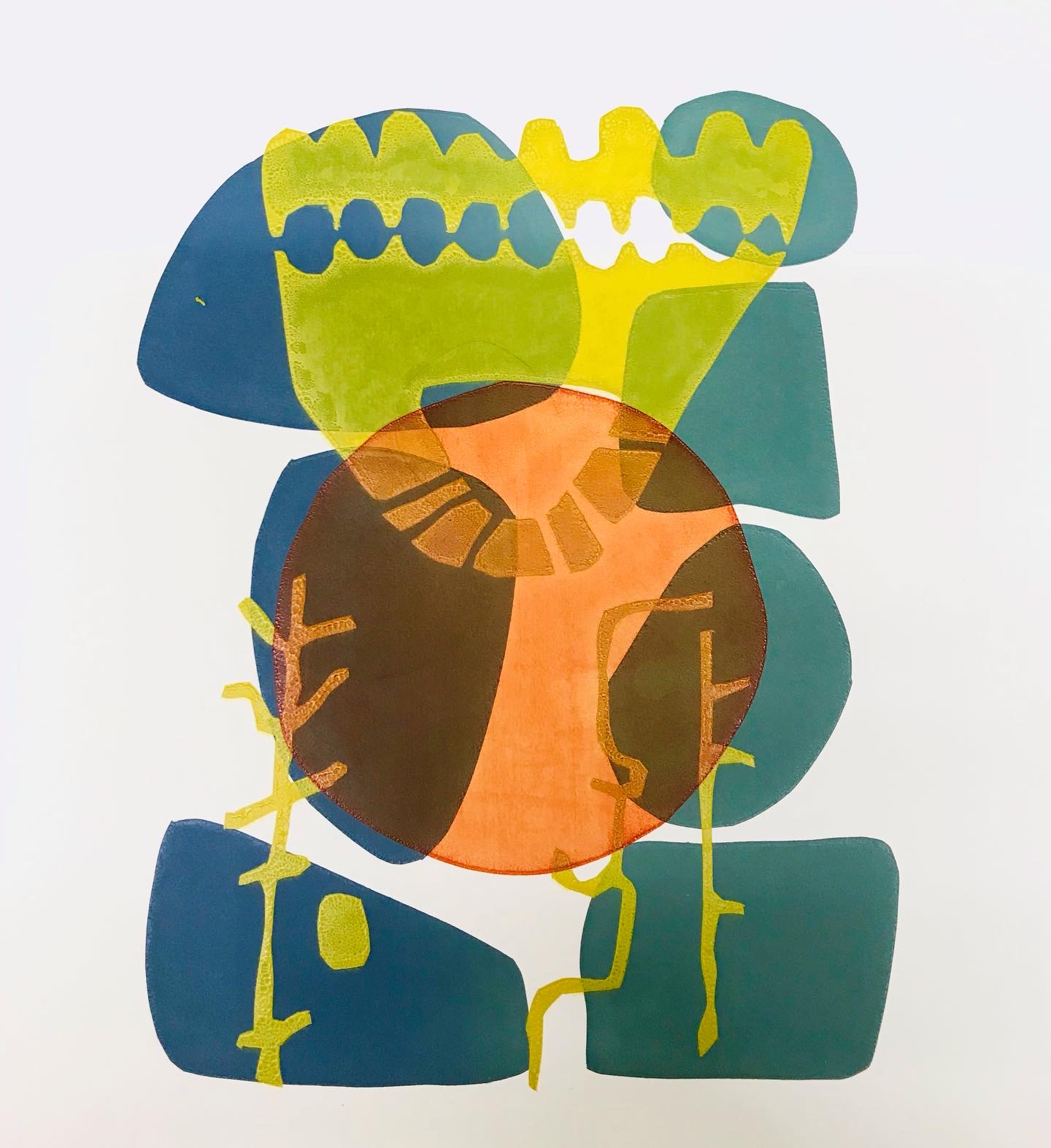
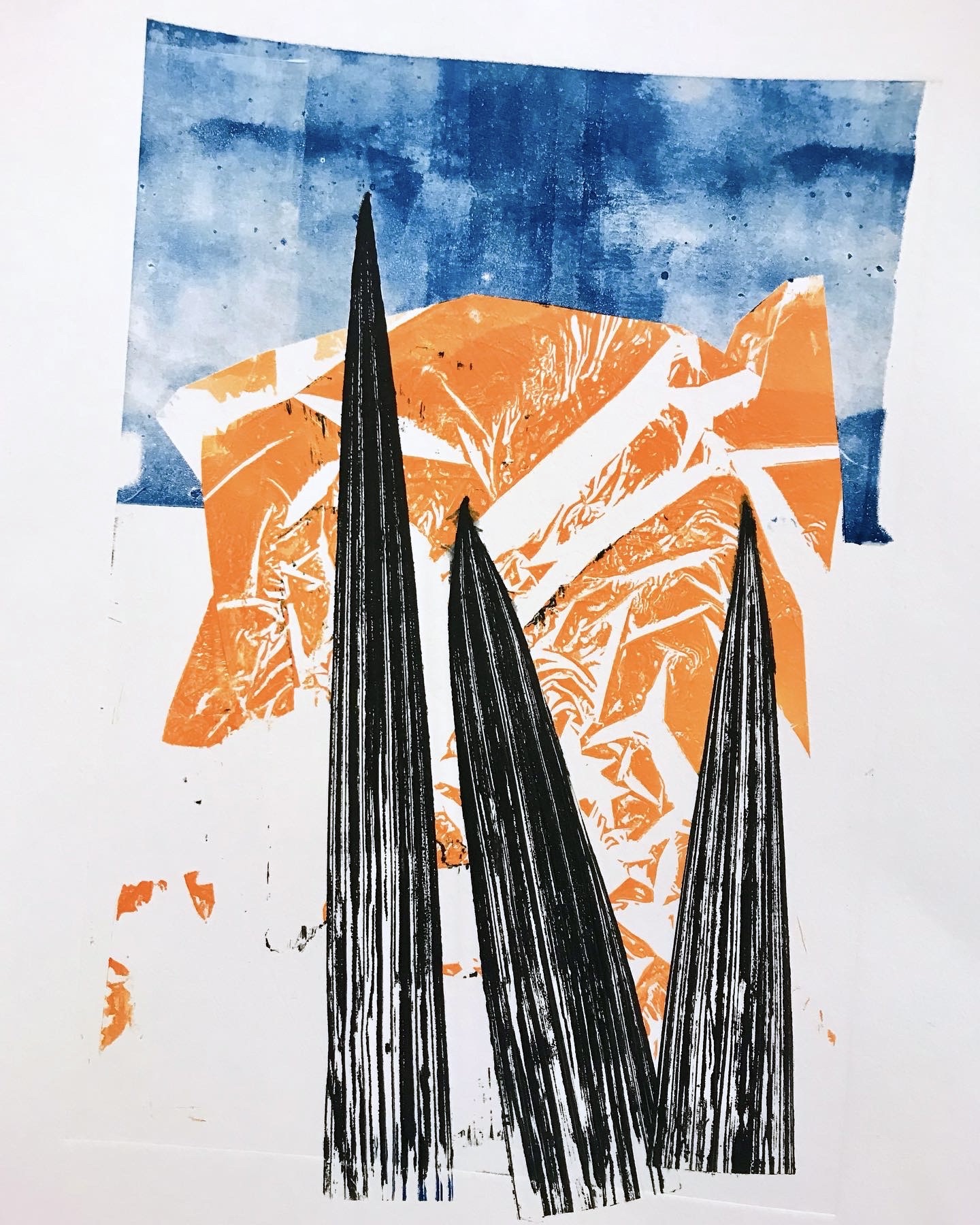
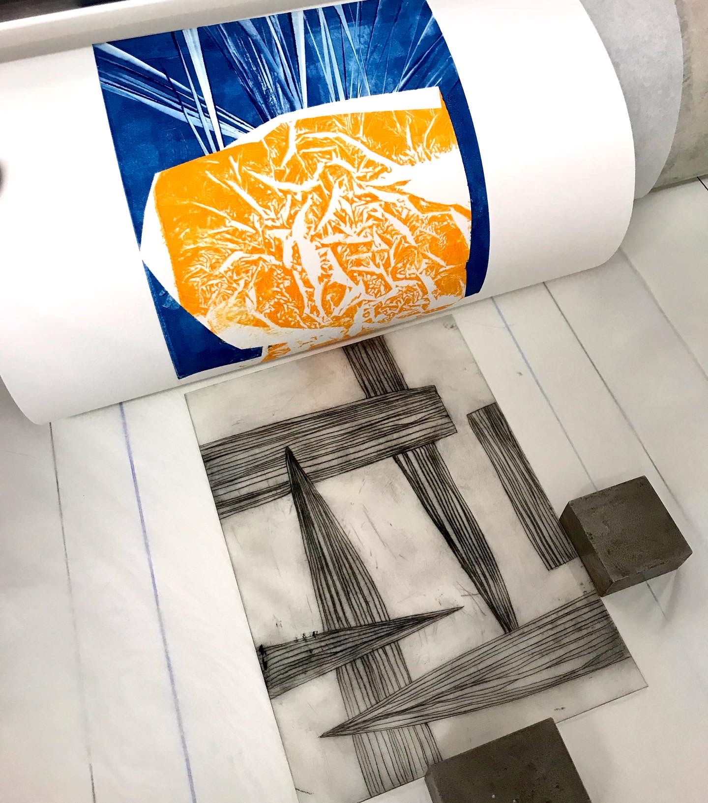
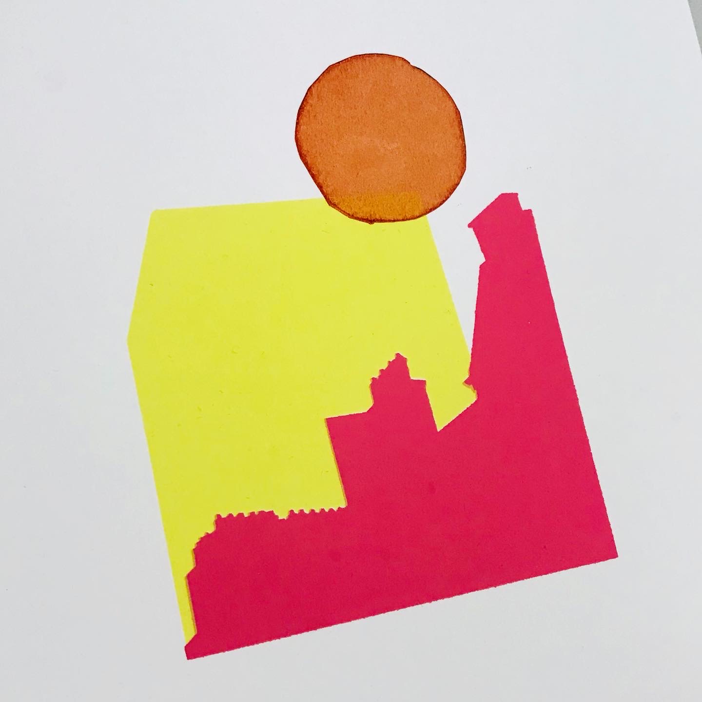
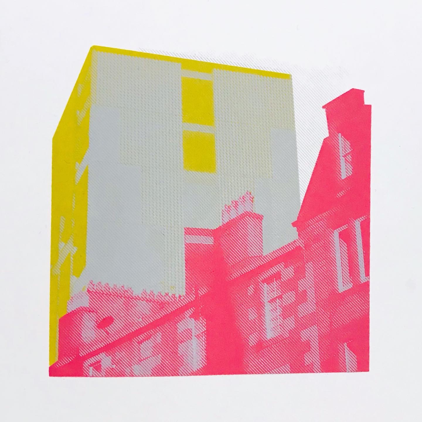
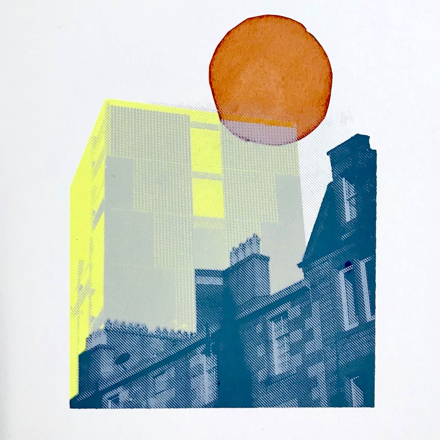
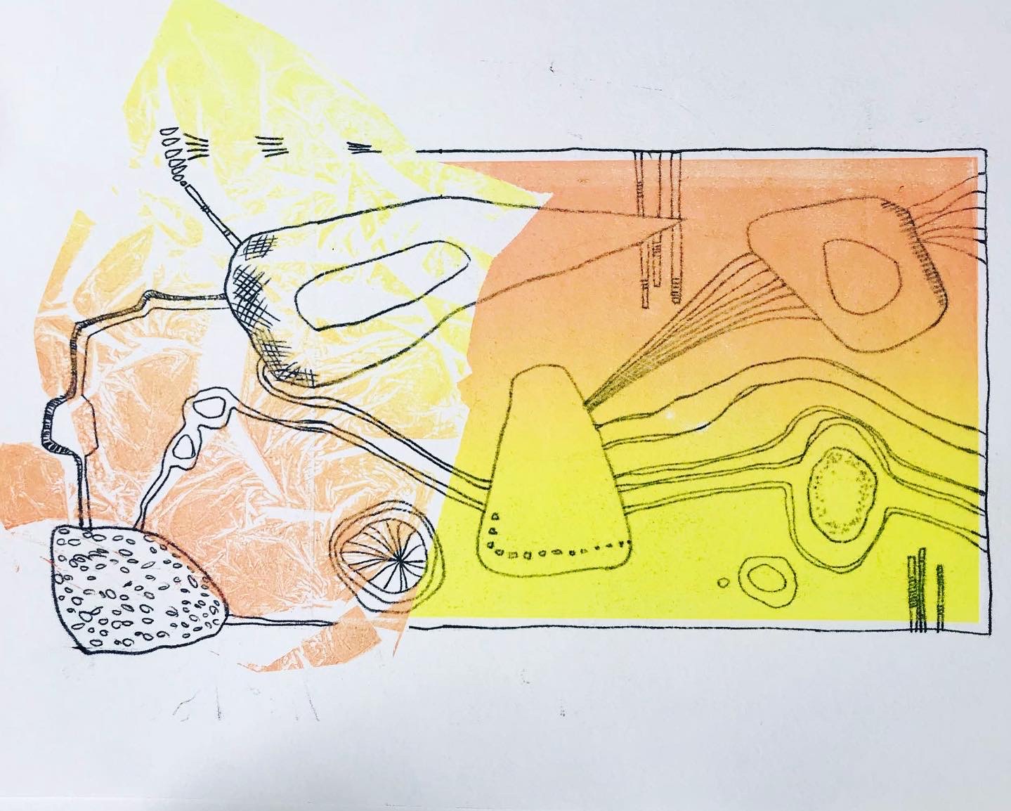
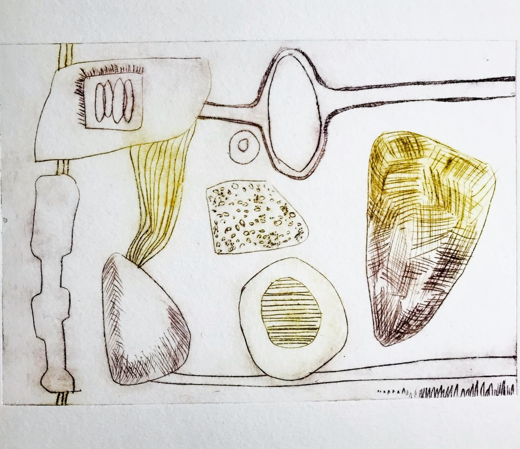
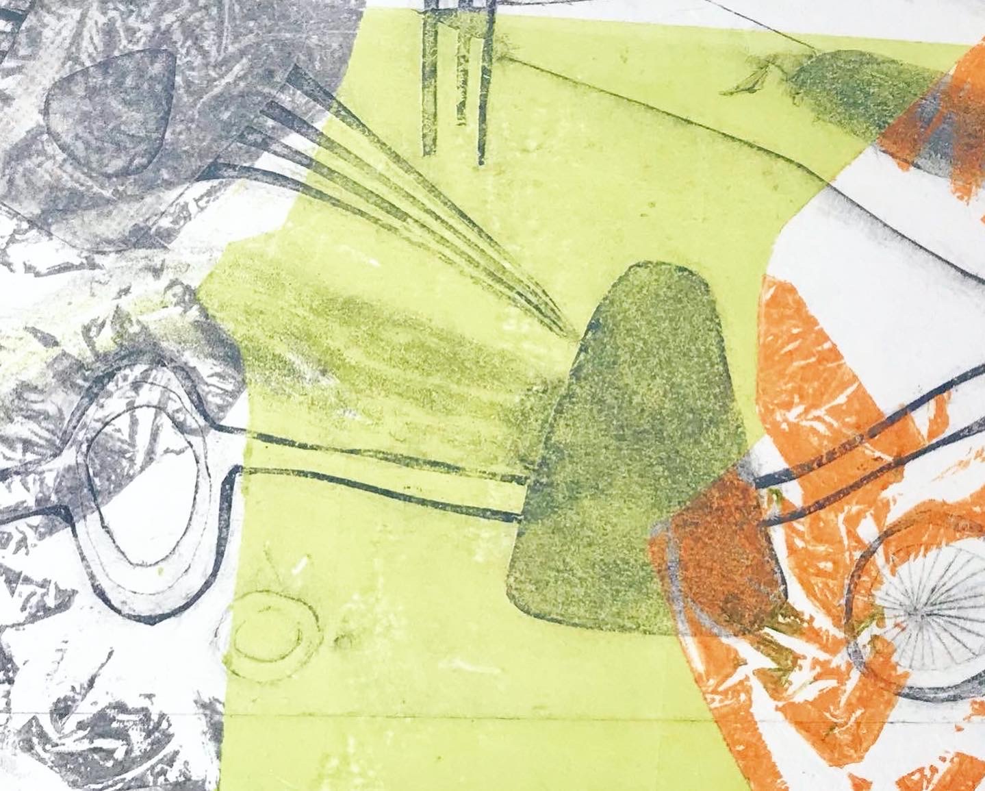
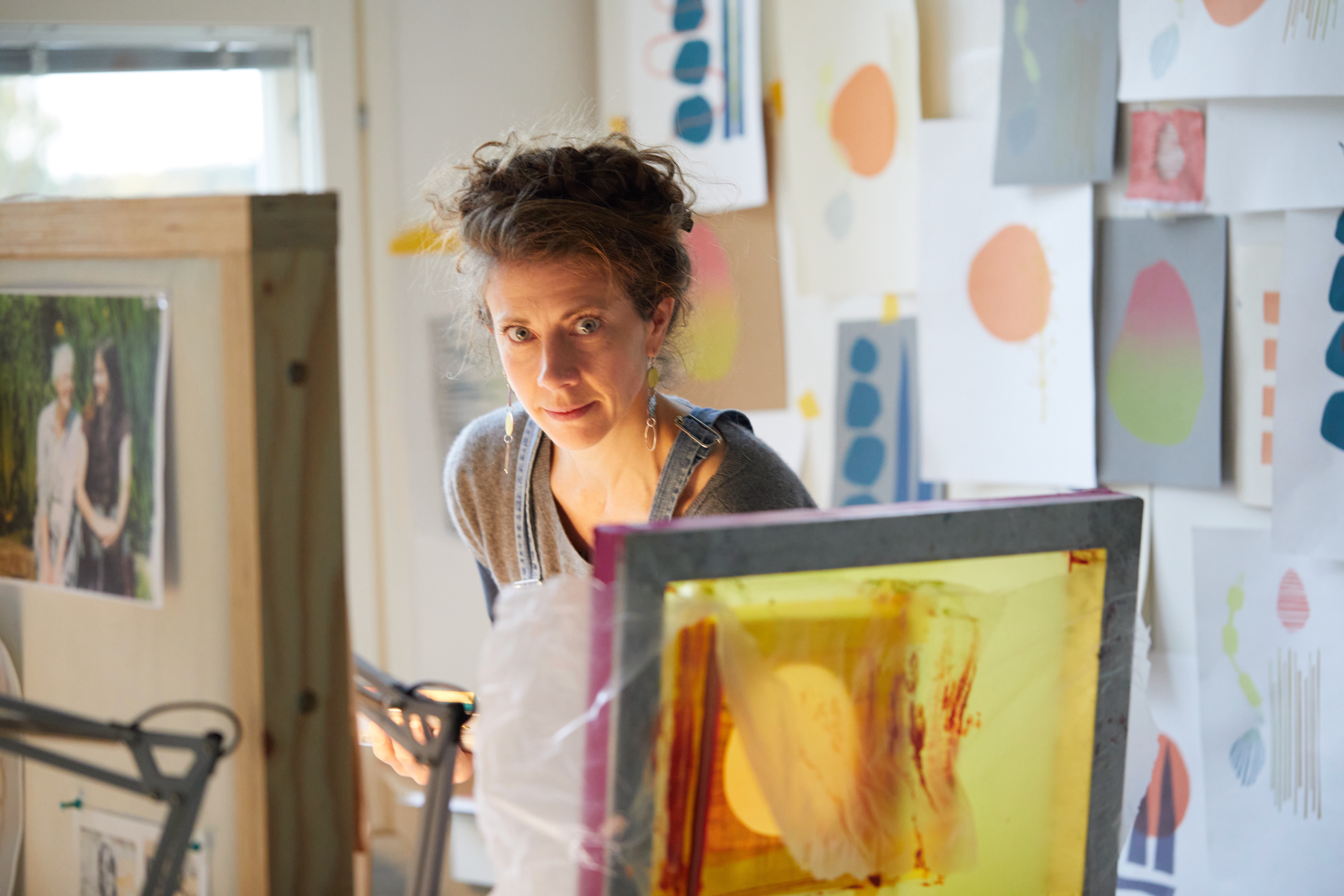
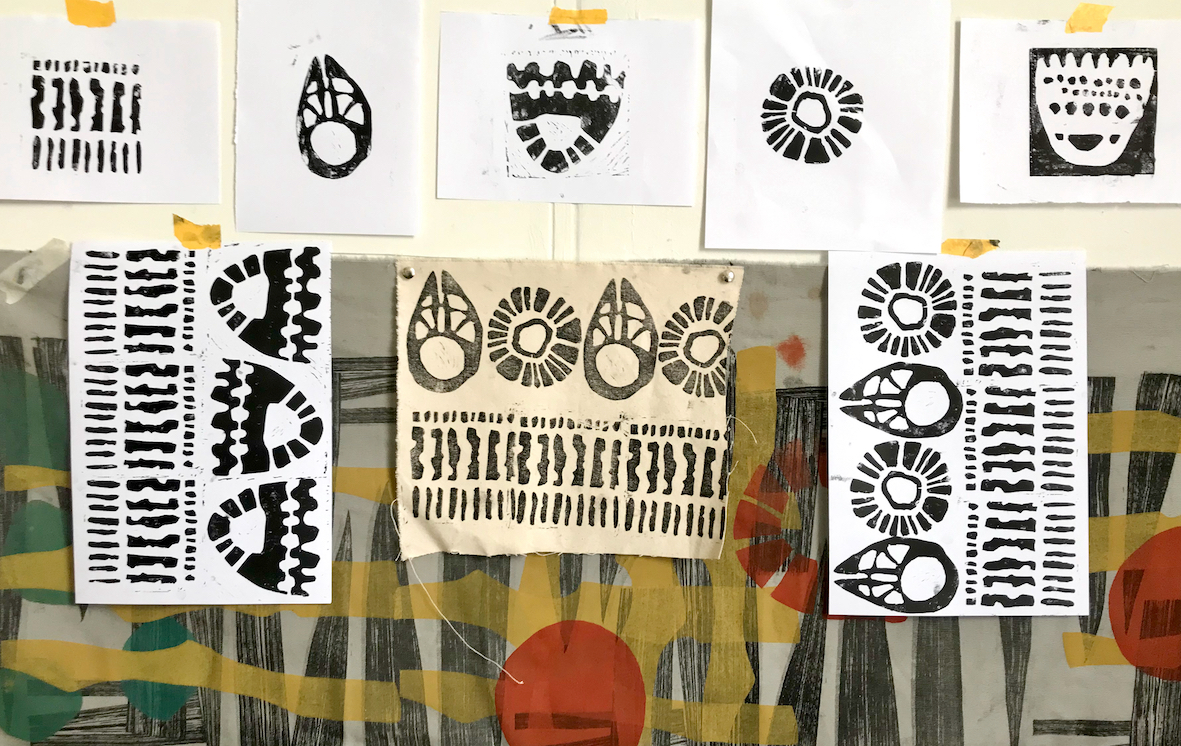
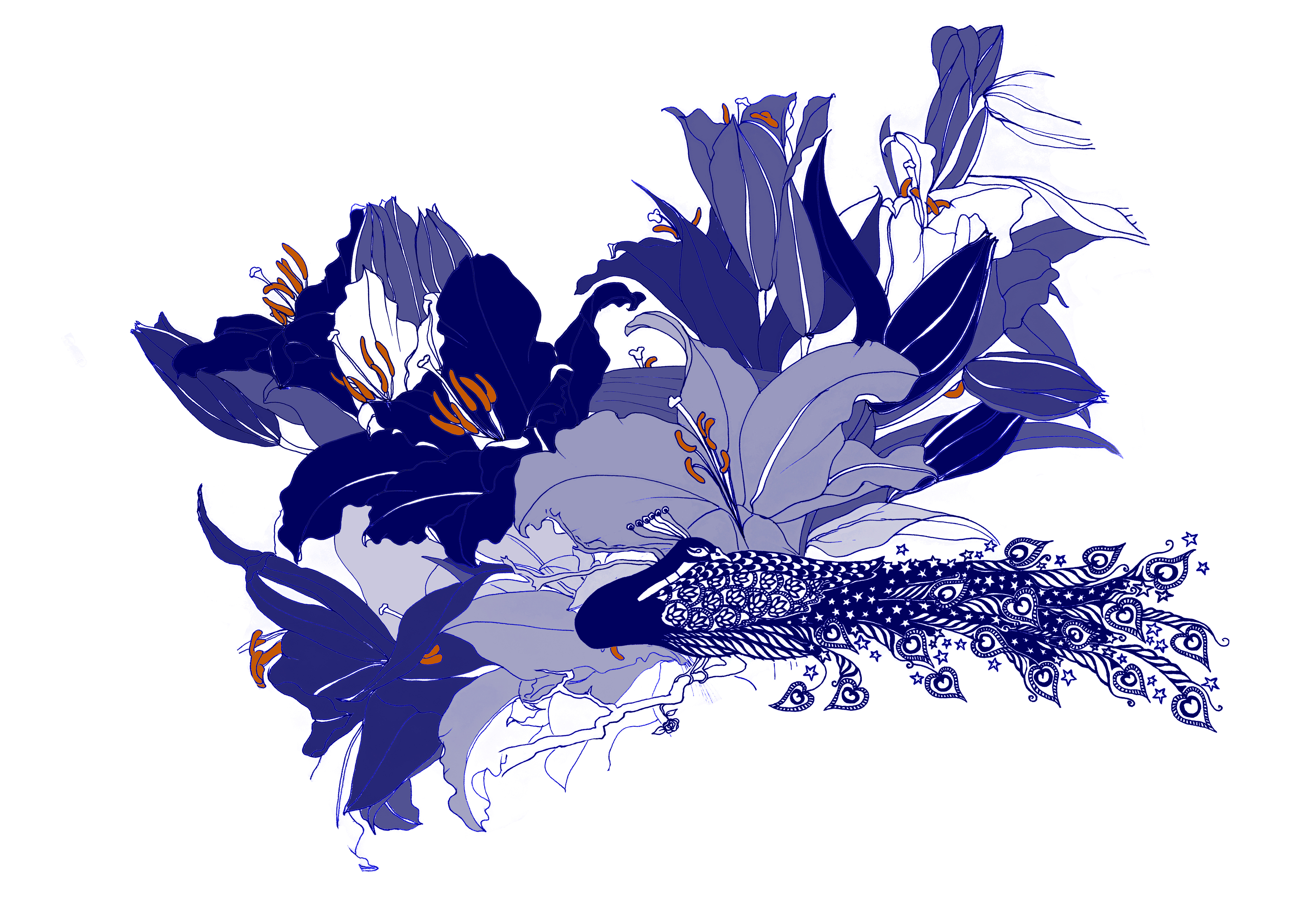
In September I was fortunate enough to spend a whole month in Finland at Arteles Creative Centre, taking part in an edition of their tech-free Back to Basics residency program. A much needed pause on life and work and normality after a difficult summer losing my mother and having covid again. I chose to focus on screenprint whilst I was there, with a very simple – basic! – set up for stencil screen printing. It was really liberating to be confined to one technique and medium as I always find I work best within a set design brief.
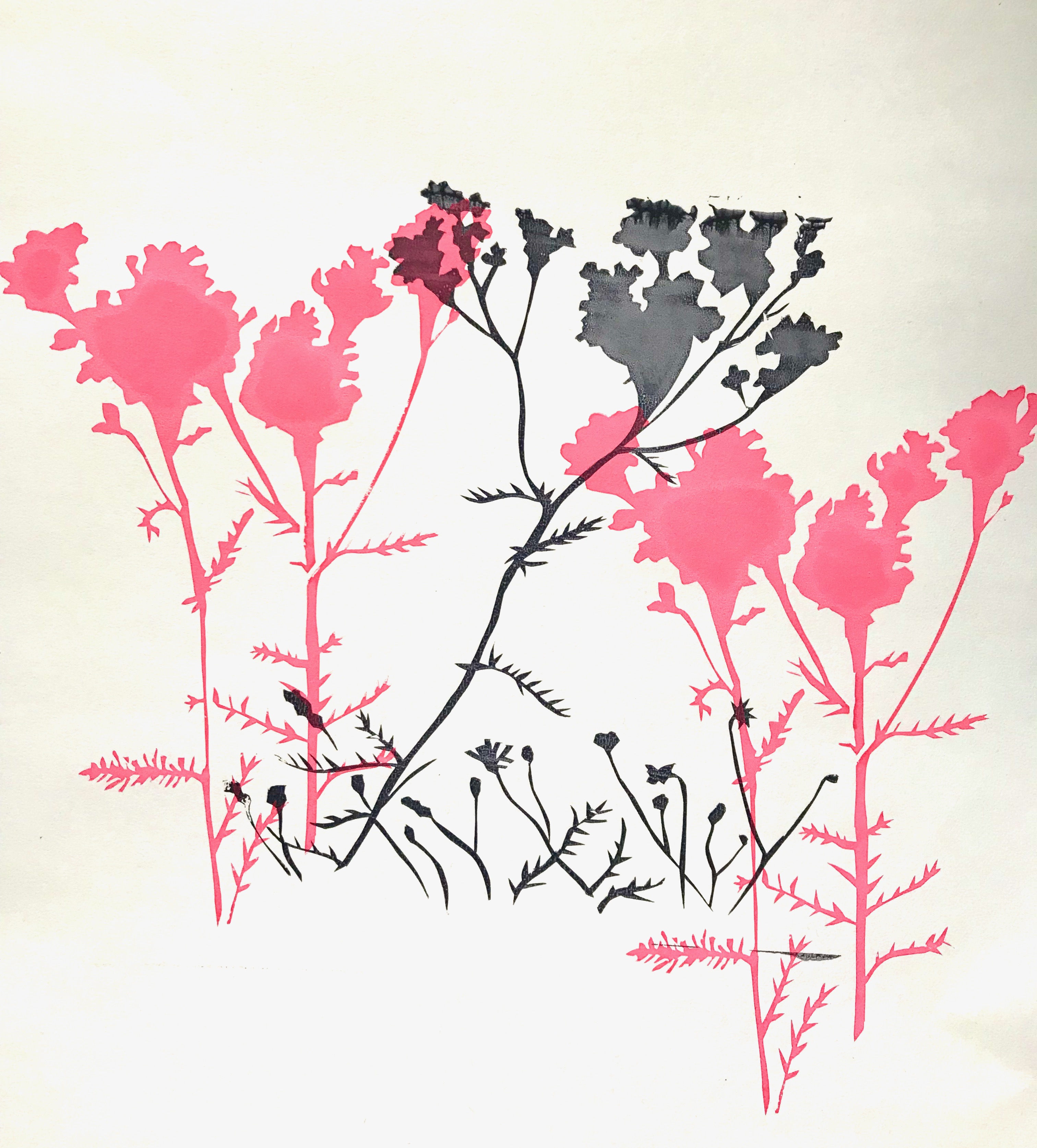
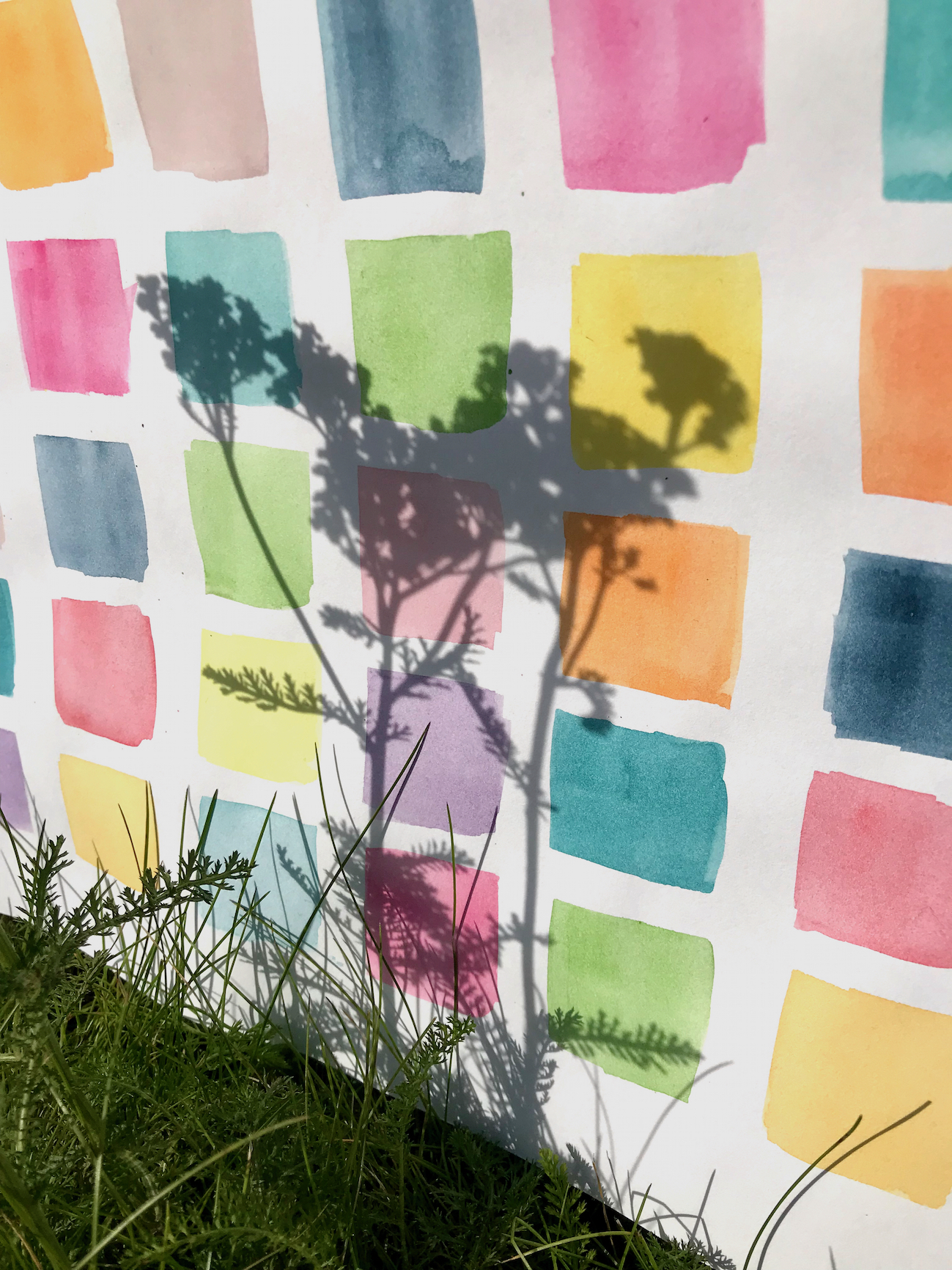
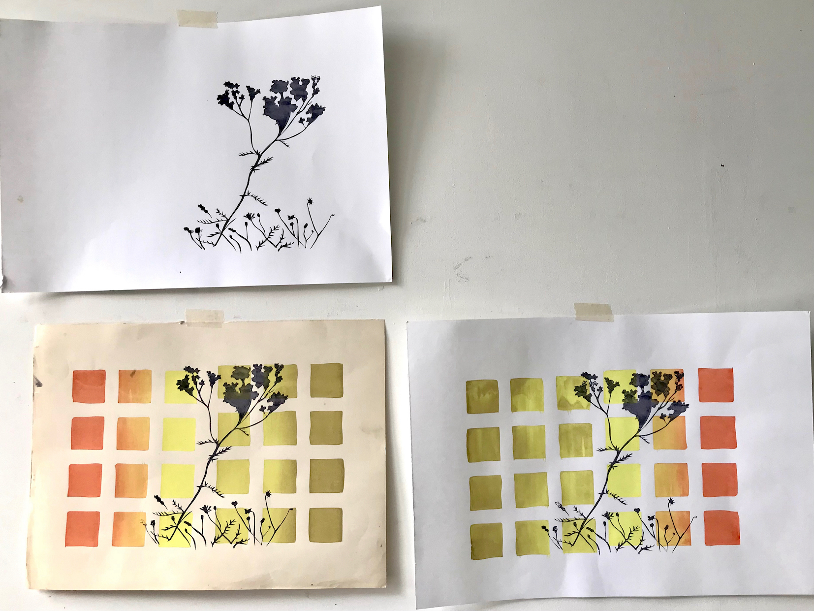
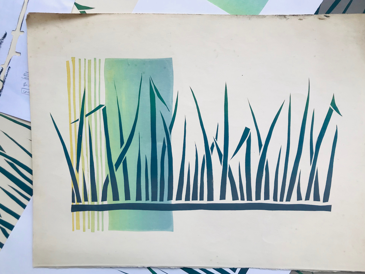
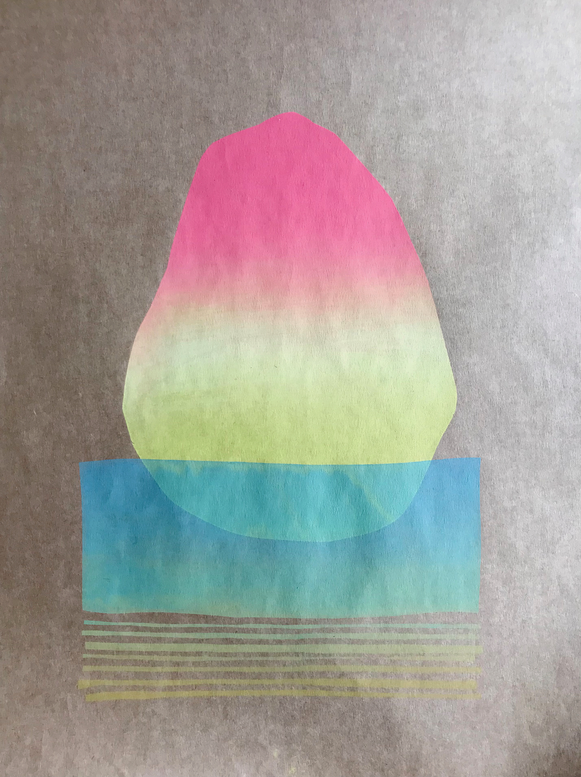
It was a really diverse cohort of residents and the breadth of our output and inspiration was really valuable. I mainly worked with ideas that spontaneously occurred to me whilst in the surrounding forest area – walking, running or wild swimming. And ideas trialled led to further ideas… I enjoyed creating overlapping runs of prints with elements mixed and overlaid from different stages in the process. I’ll share some images here of the symbolism I came up with:
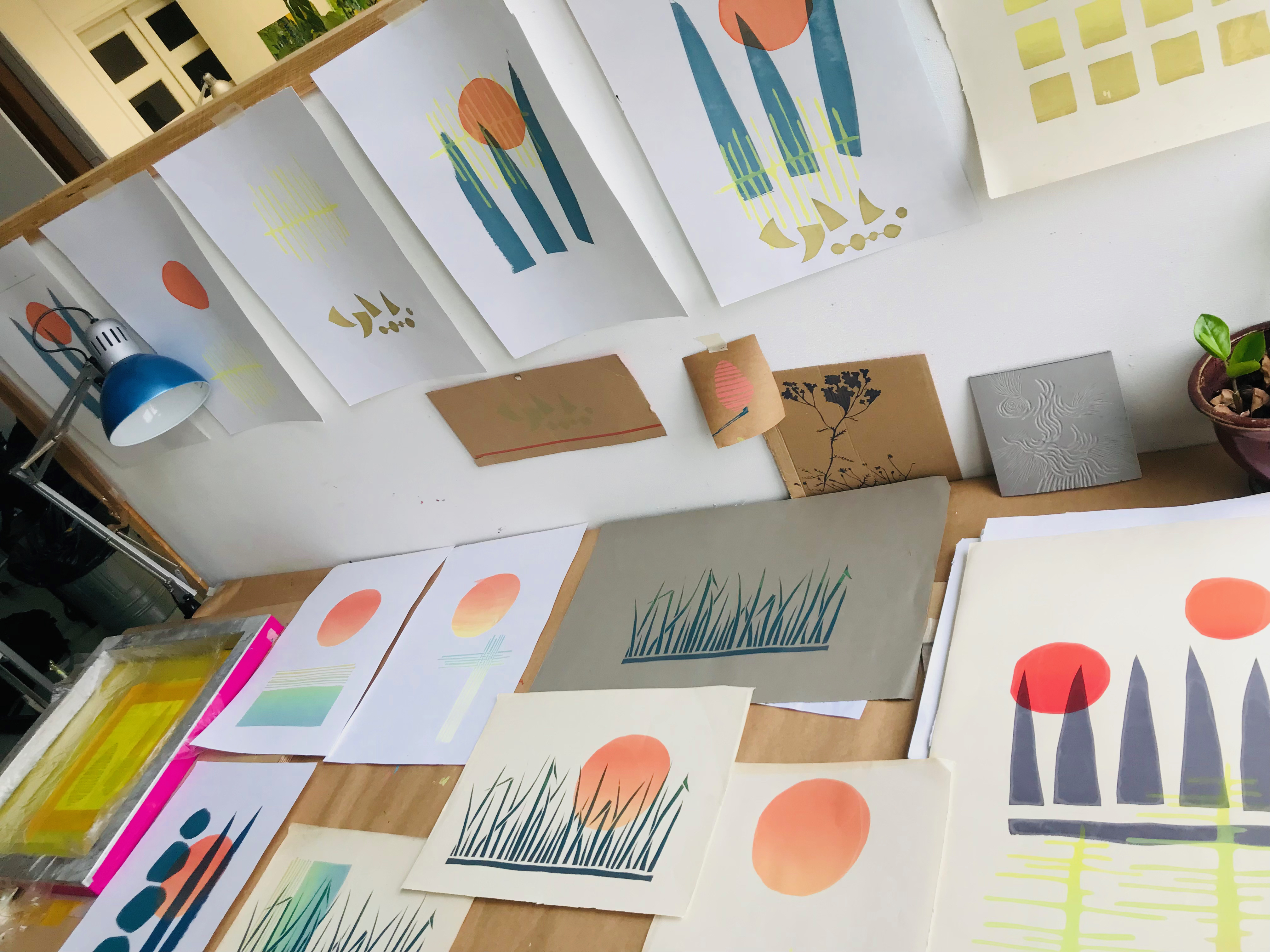
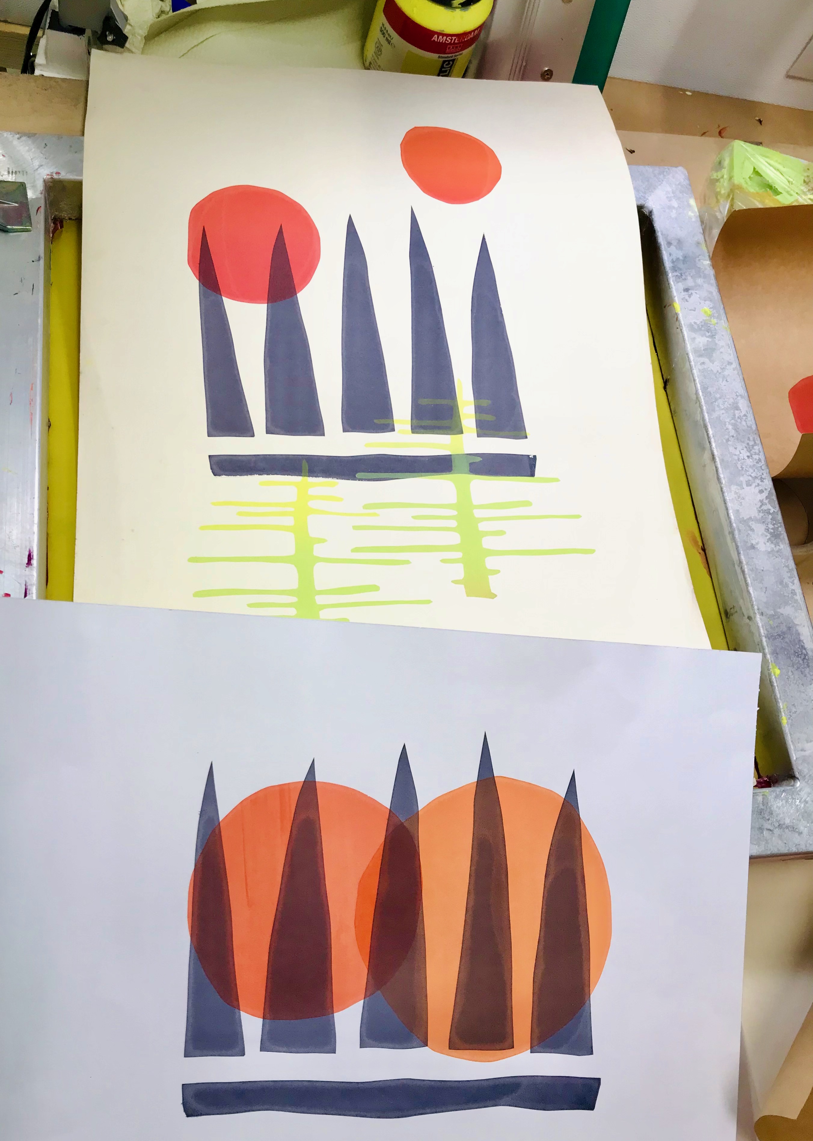
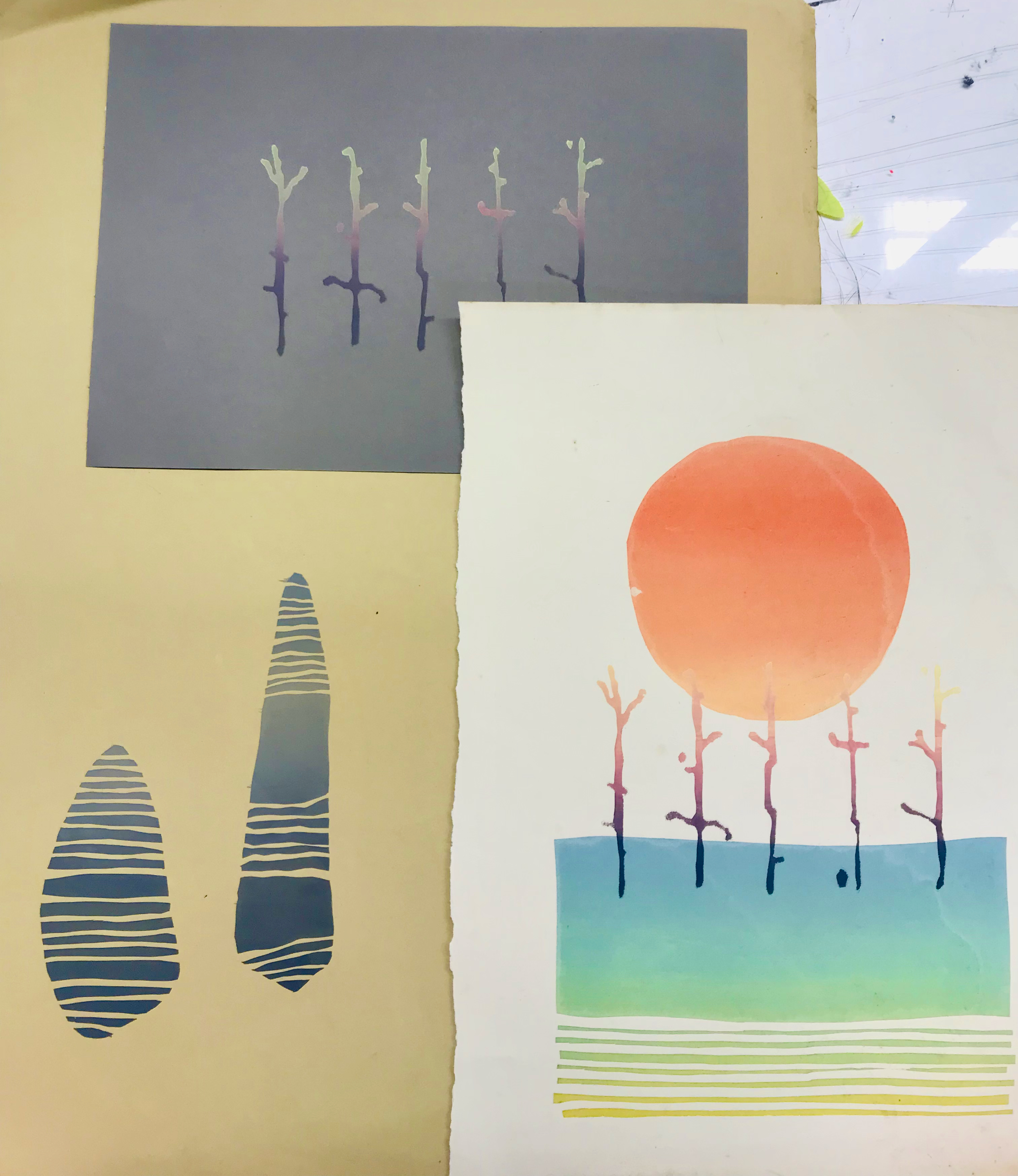
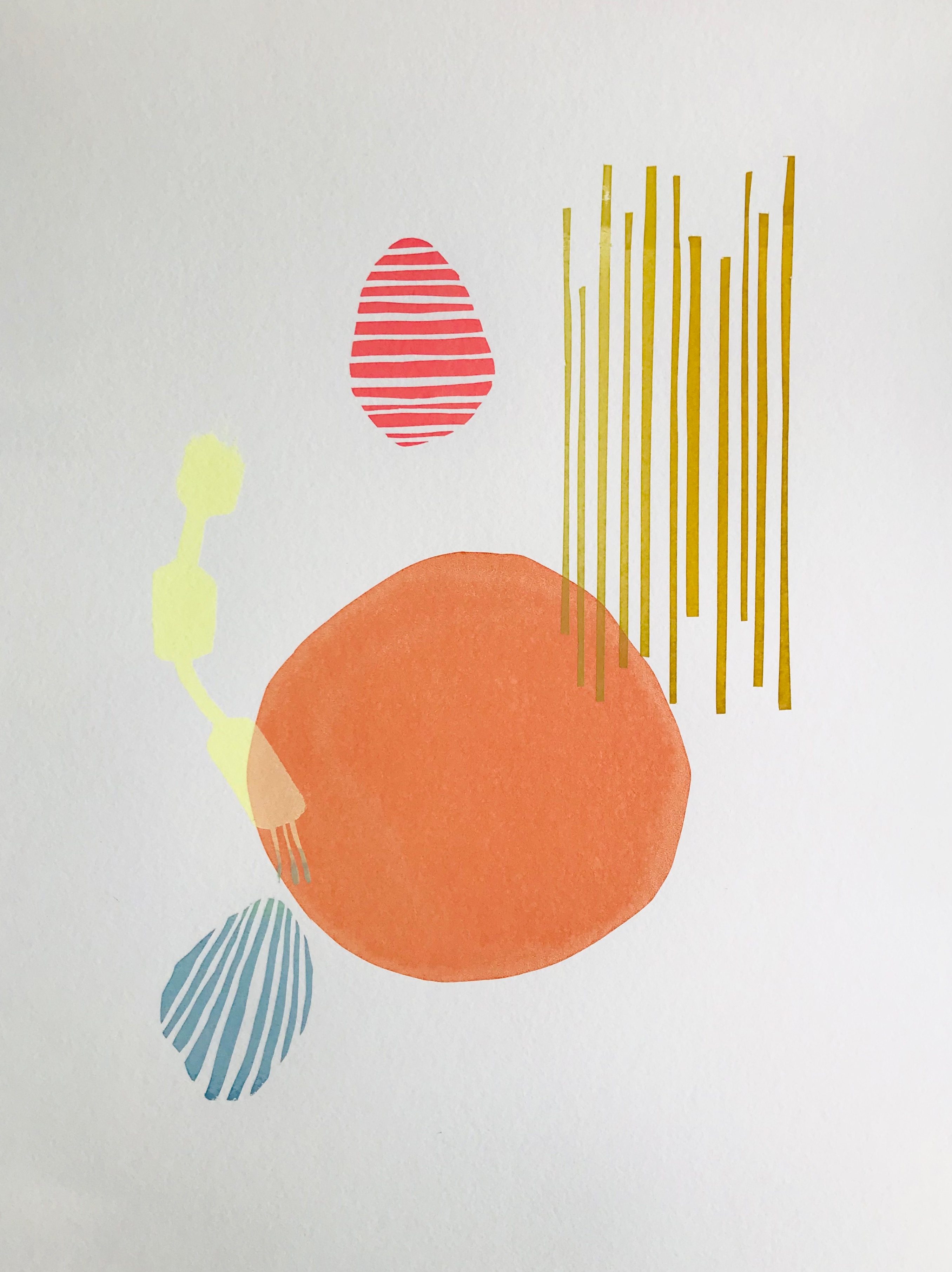
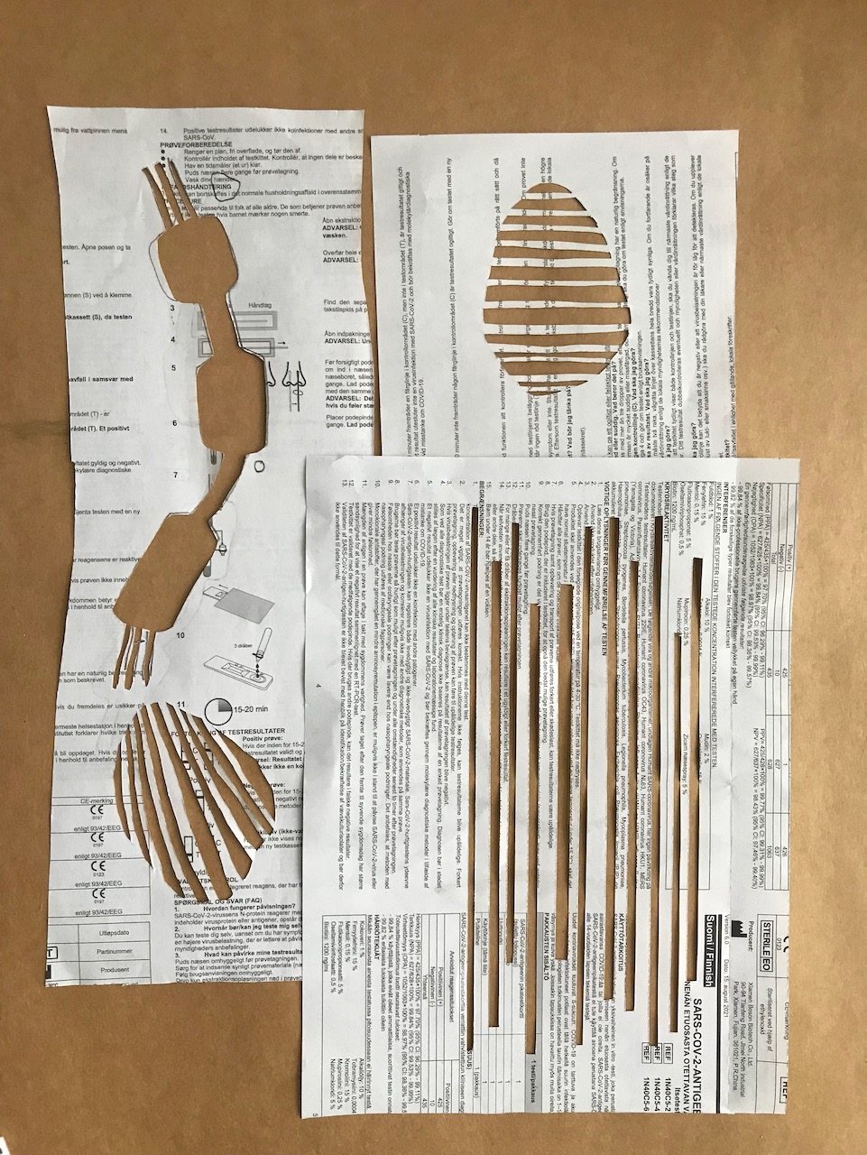
Finding ways of working and translating mental imagery involved a few different techniques. Abstract paper cutting focusing on line; using plant shadows as starting points for stencils; creating gradients of colour all played a big part in the work I created.
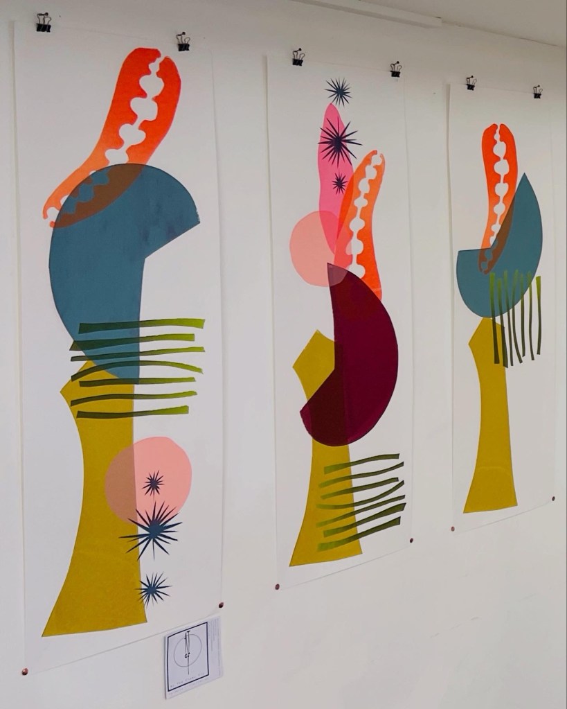
Overall, it felt like a very productive and inspiring creative interlude, providing much needed time to focus on the work I’d had the privilege of getting funding from Creative Scotland’s Open Fund to explore. I’m hoping that as time progresses I’ll be able to start translating these ideas into bespoke textiles and printed ceramic installations.
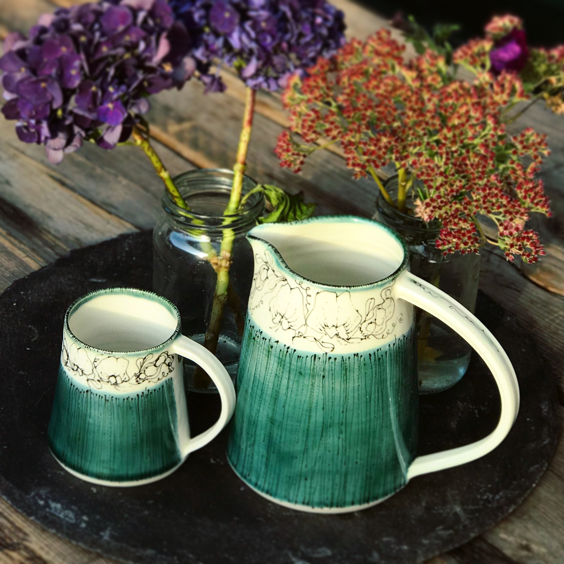
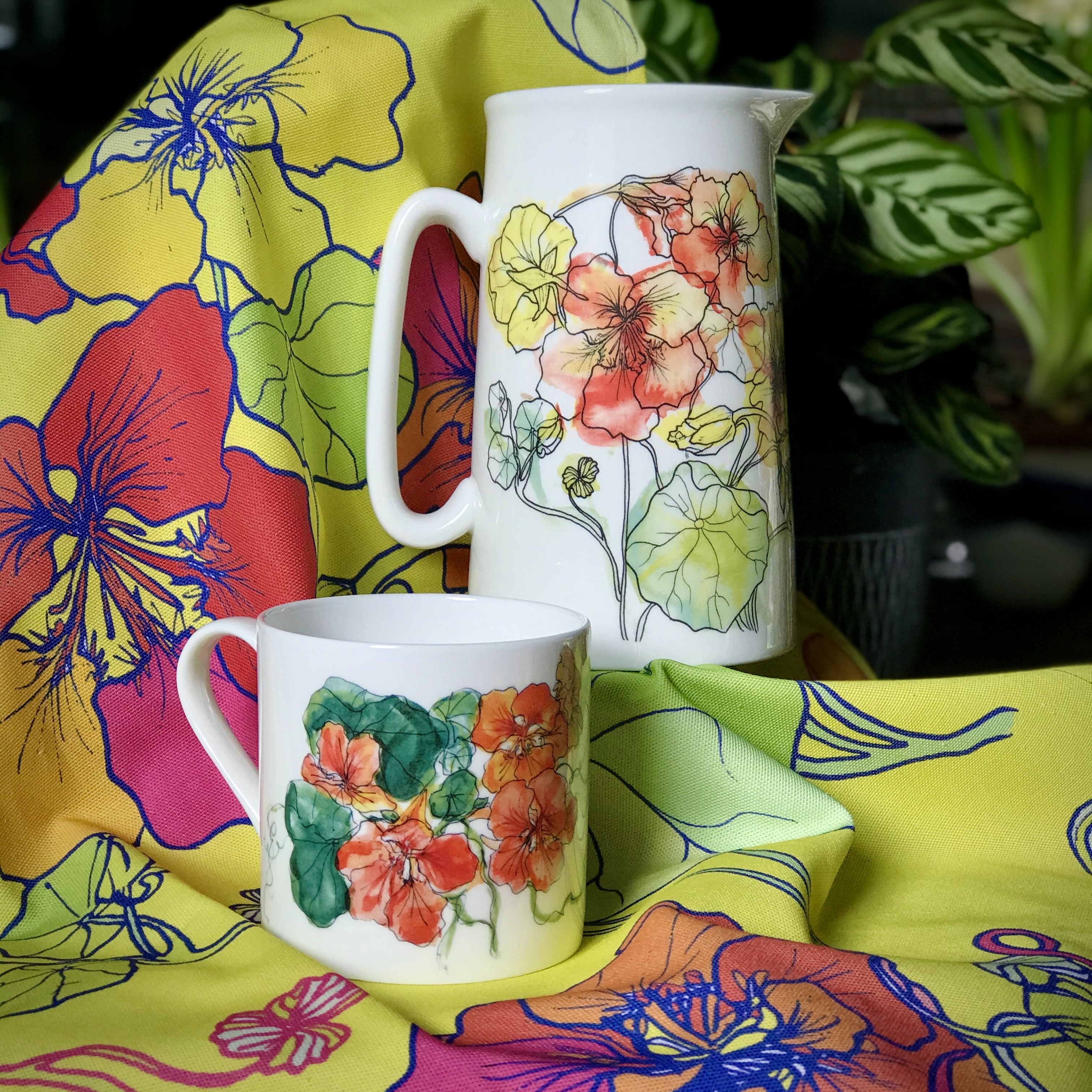
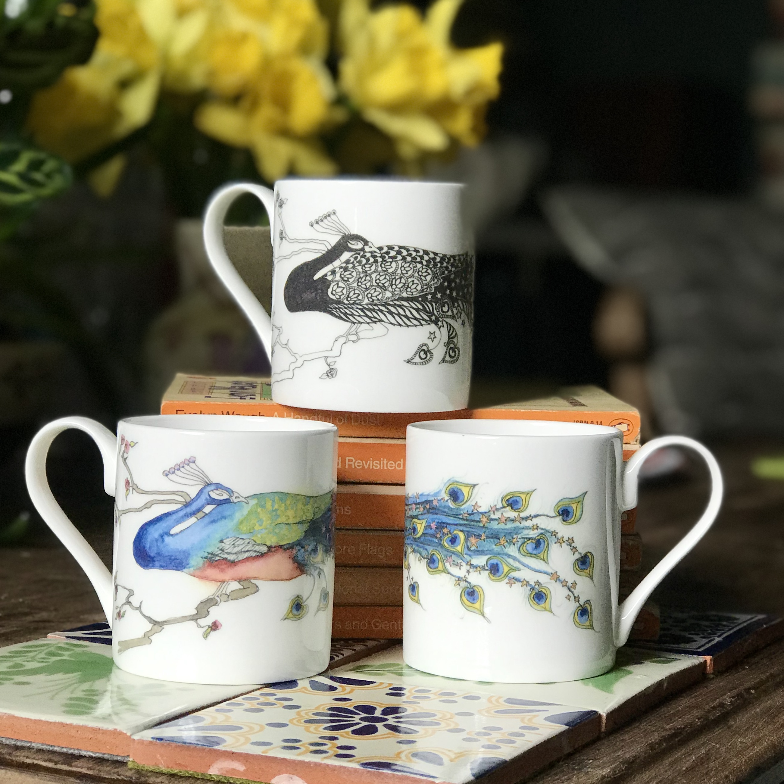
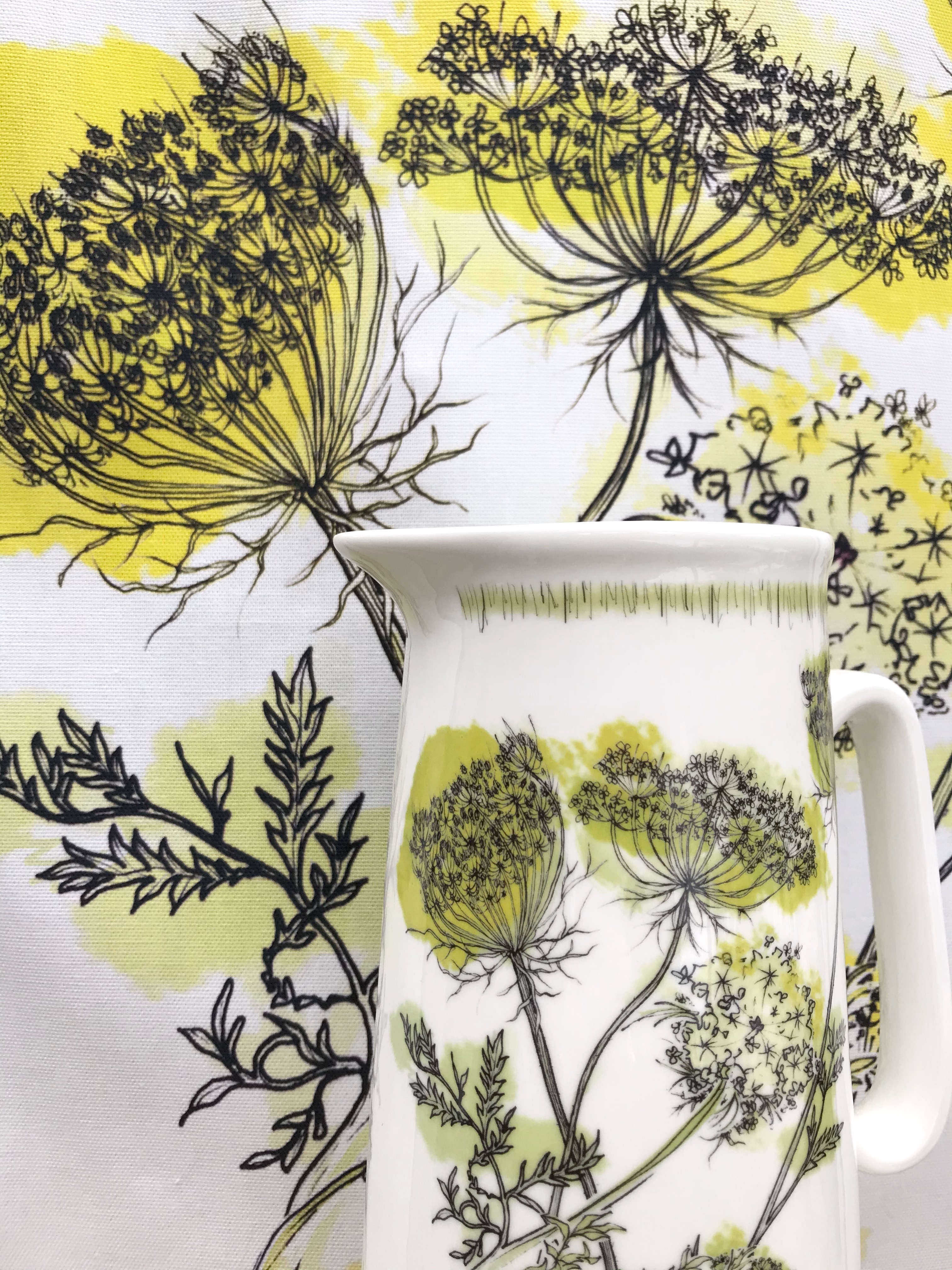

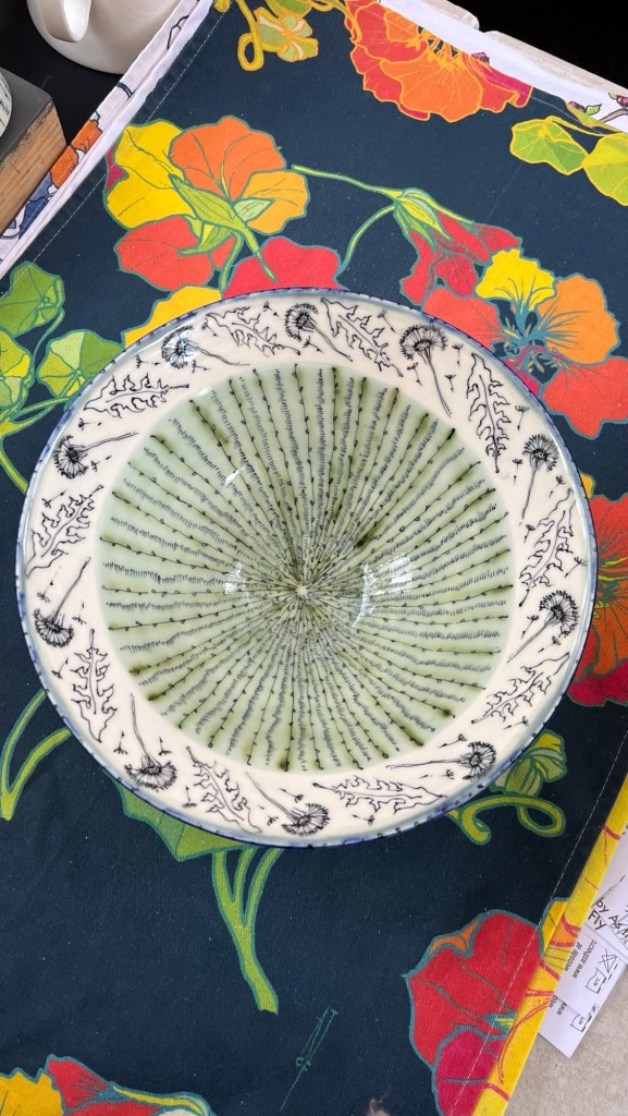
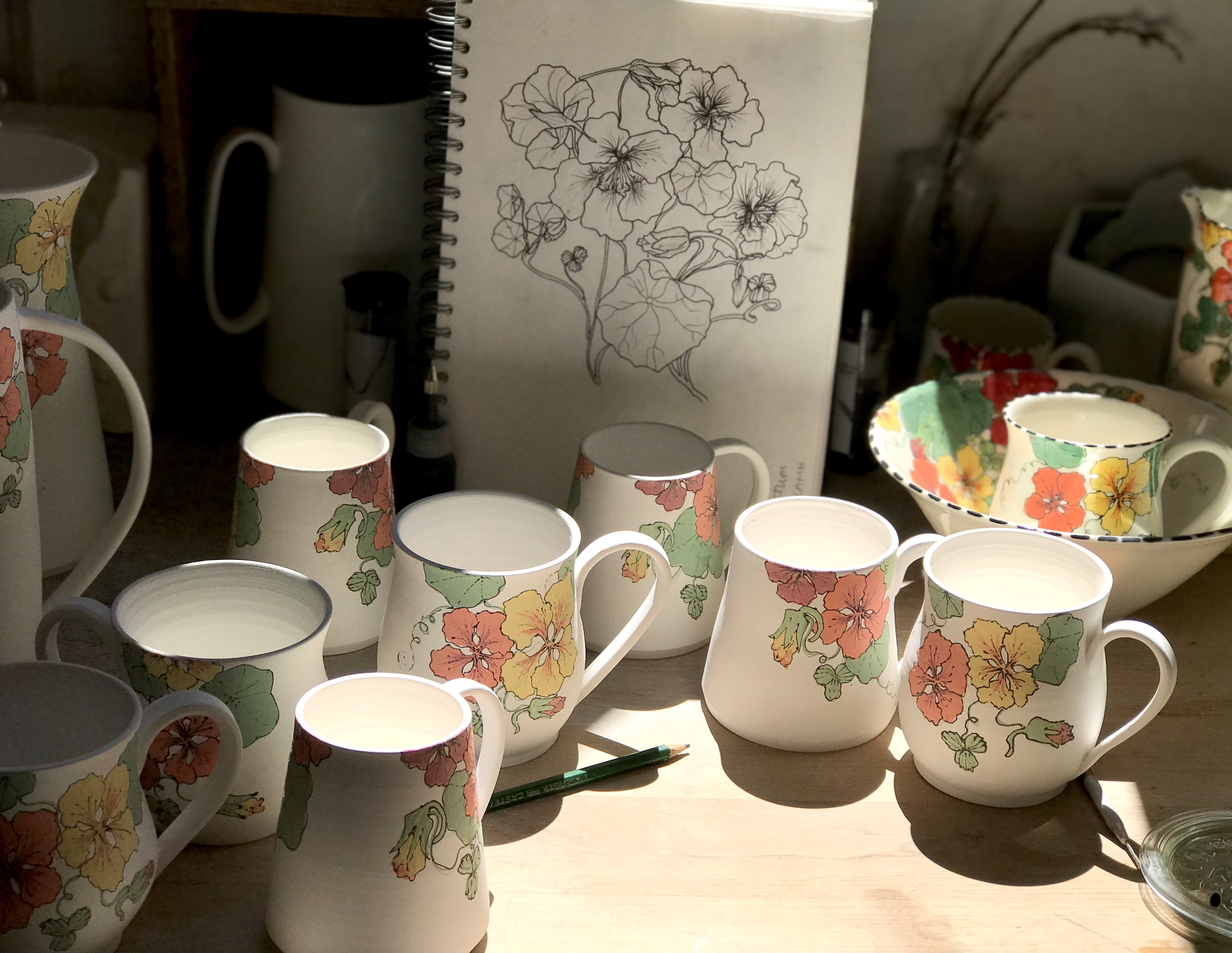
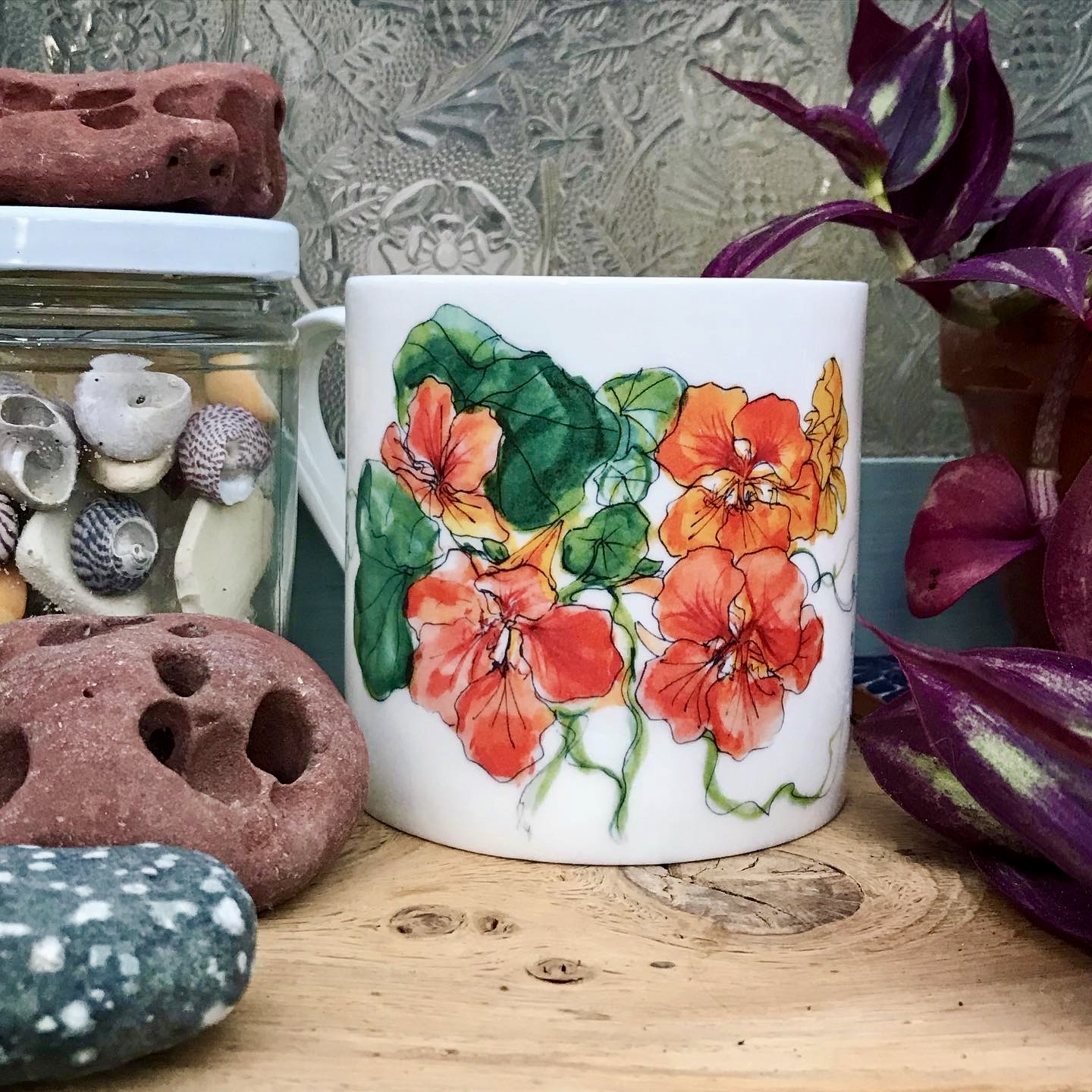
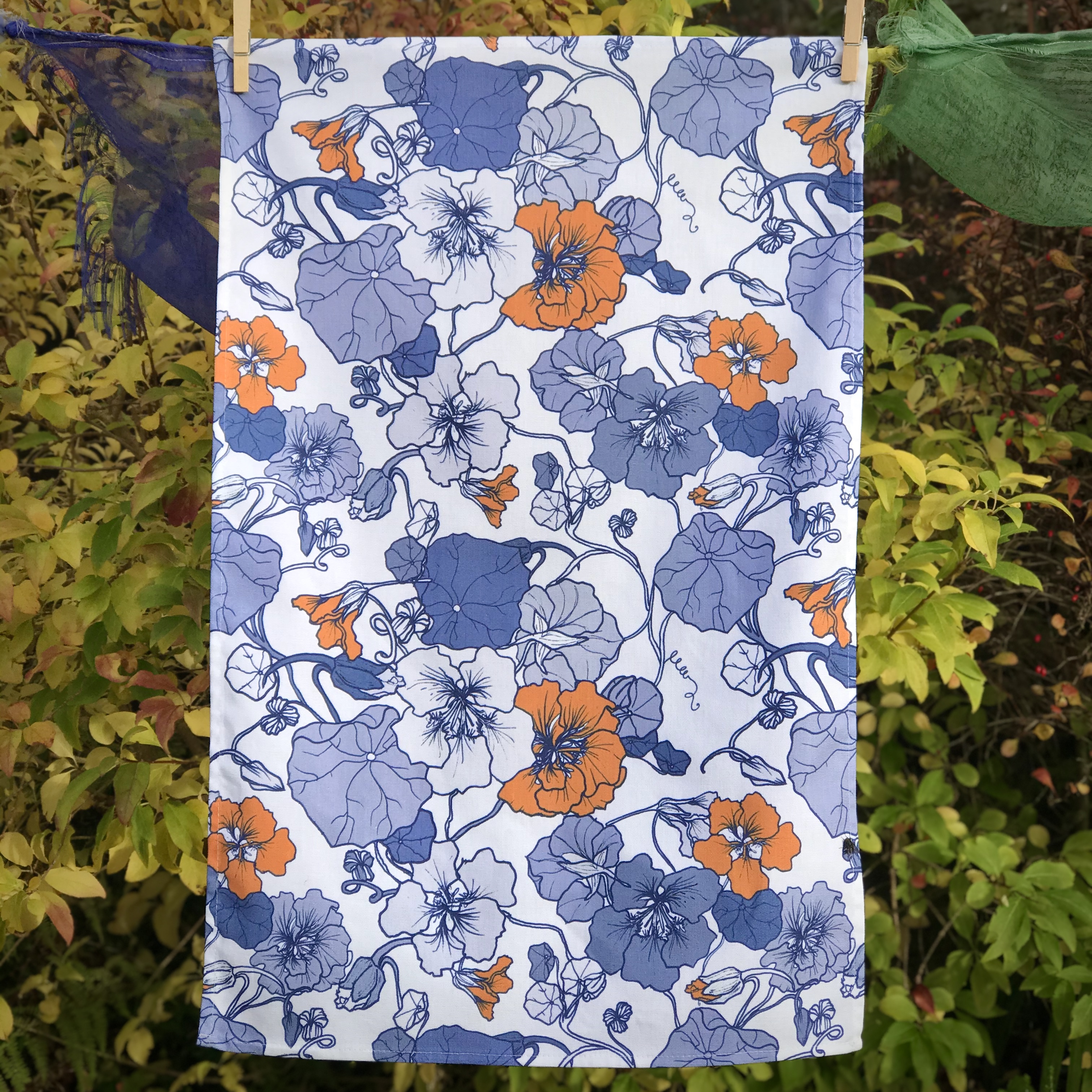
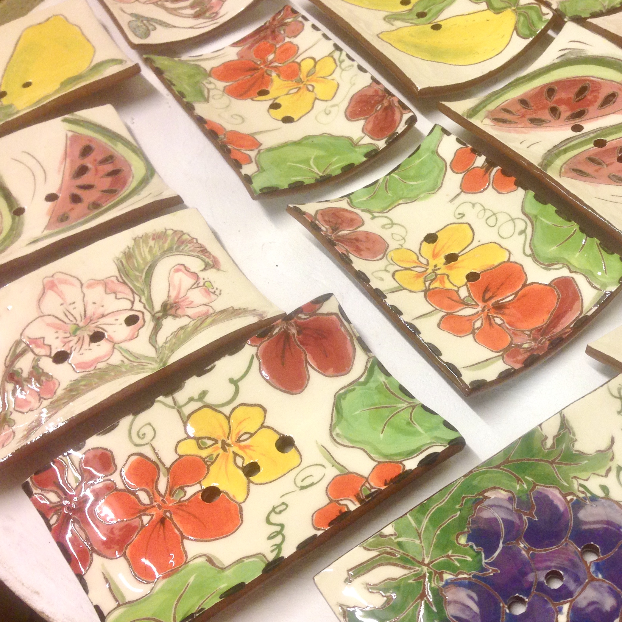
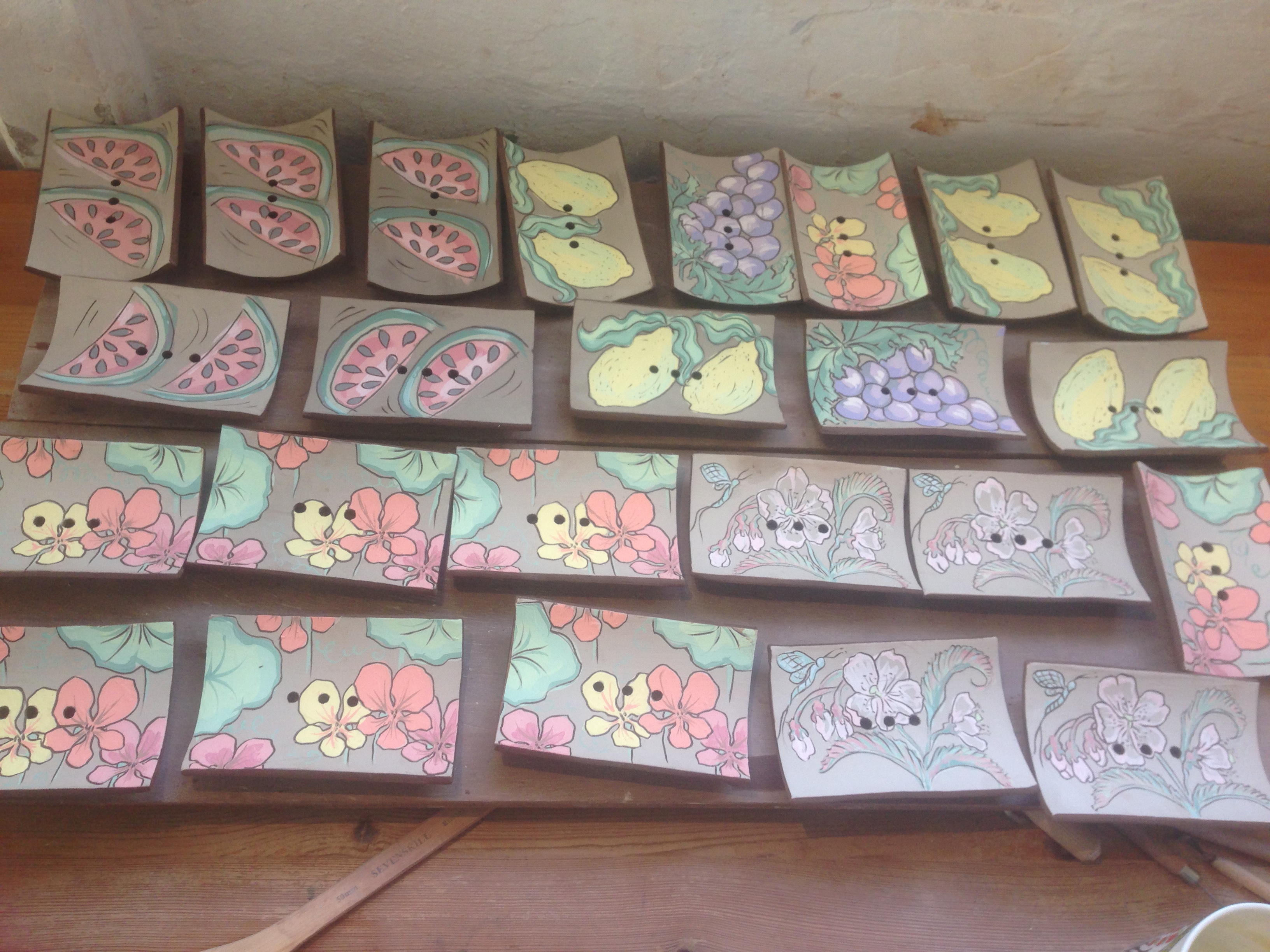
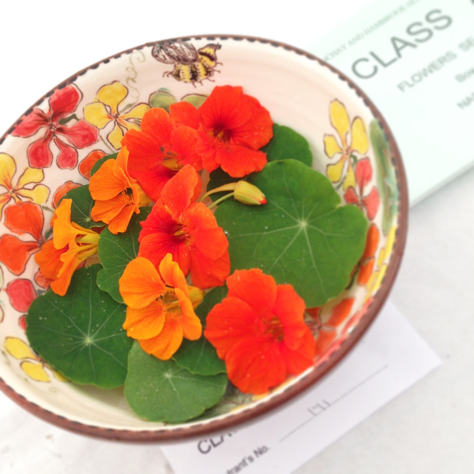
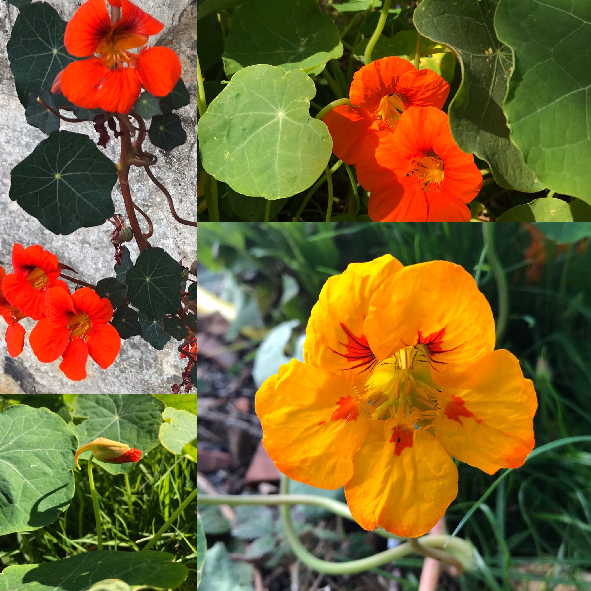
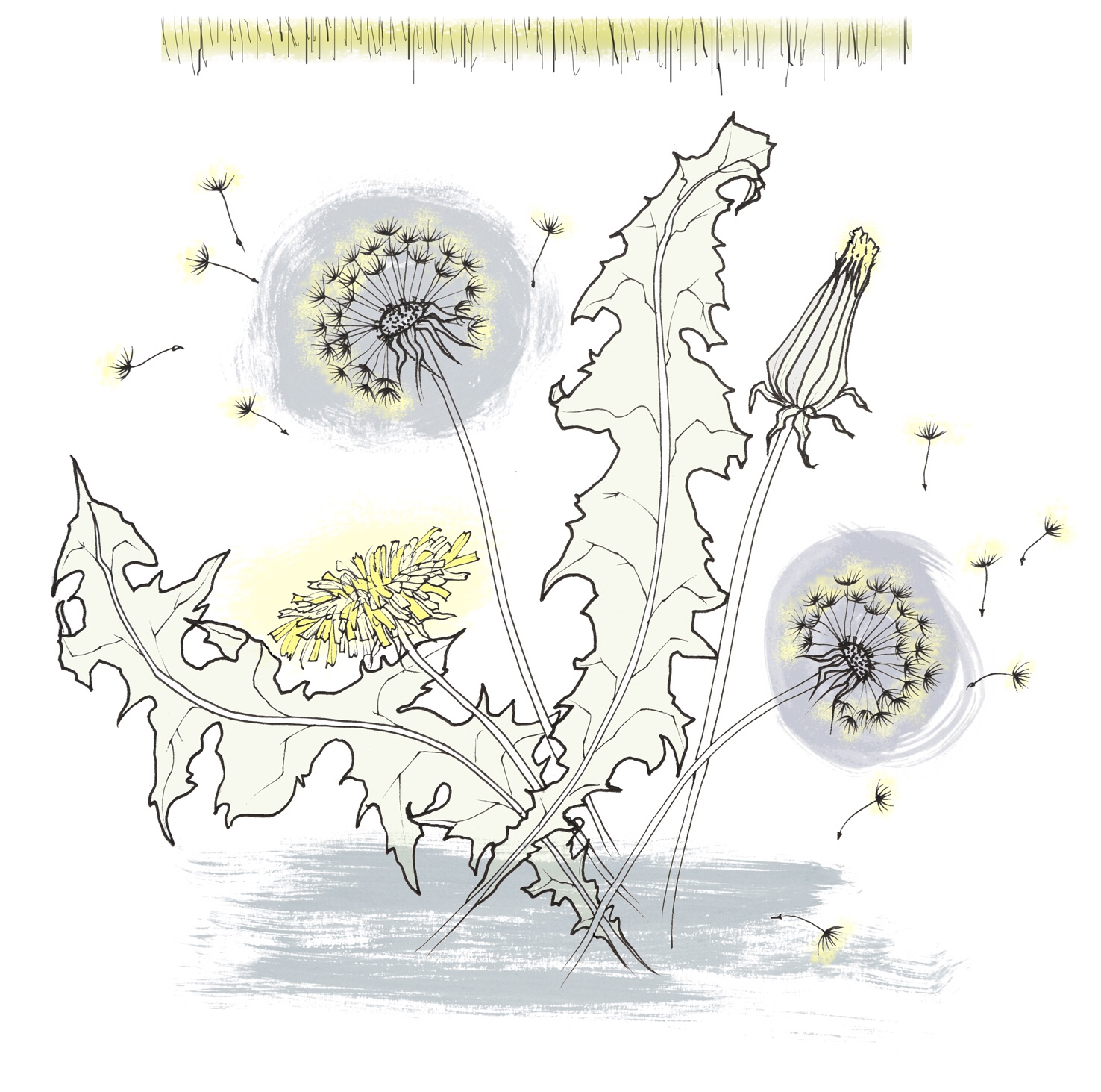
I’ve posted before about my evolving use of dandelions and how they have featured in so many ranges of my ceramics and homeware, both current and archived. Here I’m going to explore the many ways I’ve used nasturtiums in my work. Their shape, form, colour and vibrancy are an endless source of inspiration and fascination. As with all my botanical design work I begin with observed drawing.
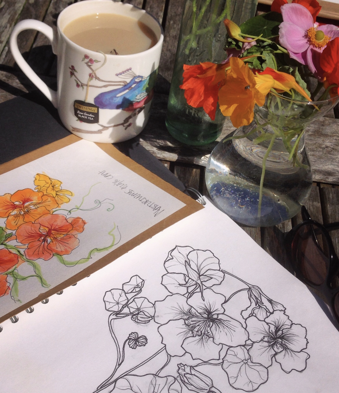
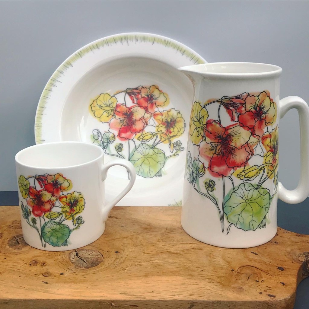
Drawing the flowers from life is my starting point for a whole host of designs across different media: transfer printed bone china ware; hand illustrated wheel thrown porcelain; colourful printed tea towels. You can see how just a handful of drawings can be put into so many different contexts and with such variety of end results.
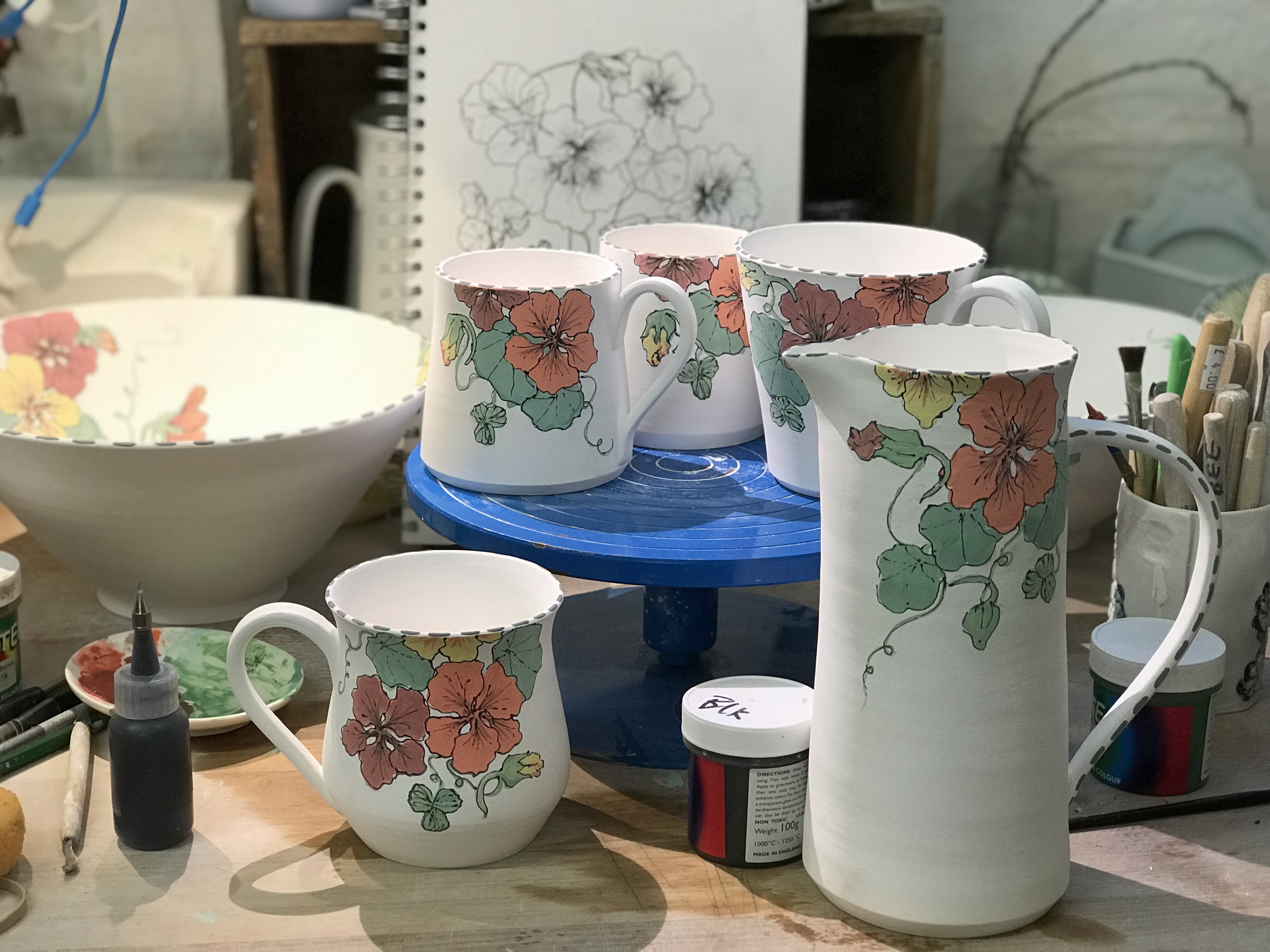
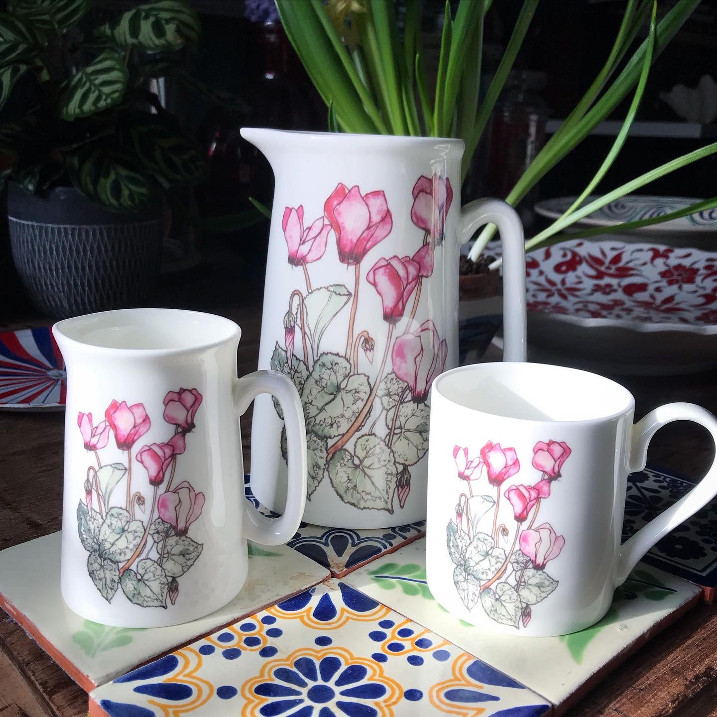
In contrast to this individually hand thrown, hand illustrated range – where each vessel is similar but unique in the exact placement or combination of flowers, buds and leaves – is my range of transfer printed bone china ware. For this I use a professional ceramic transfer print studio to digitally print my designs for me, which I then apply and fire on to Stoke-on-Trent bone china ware in my studio.
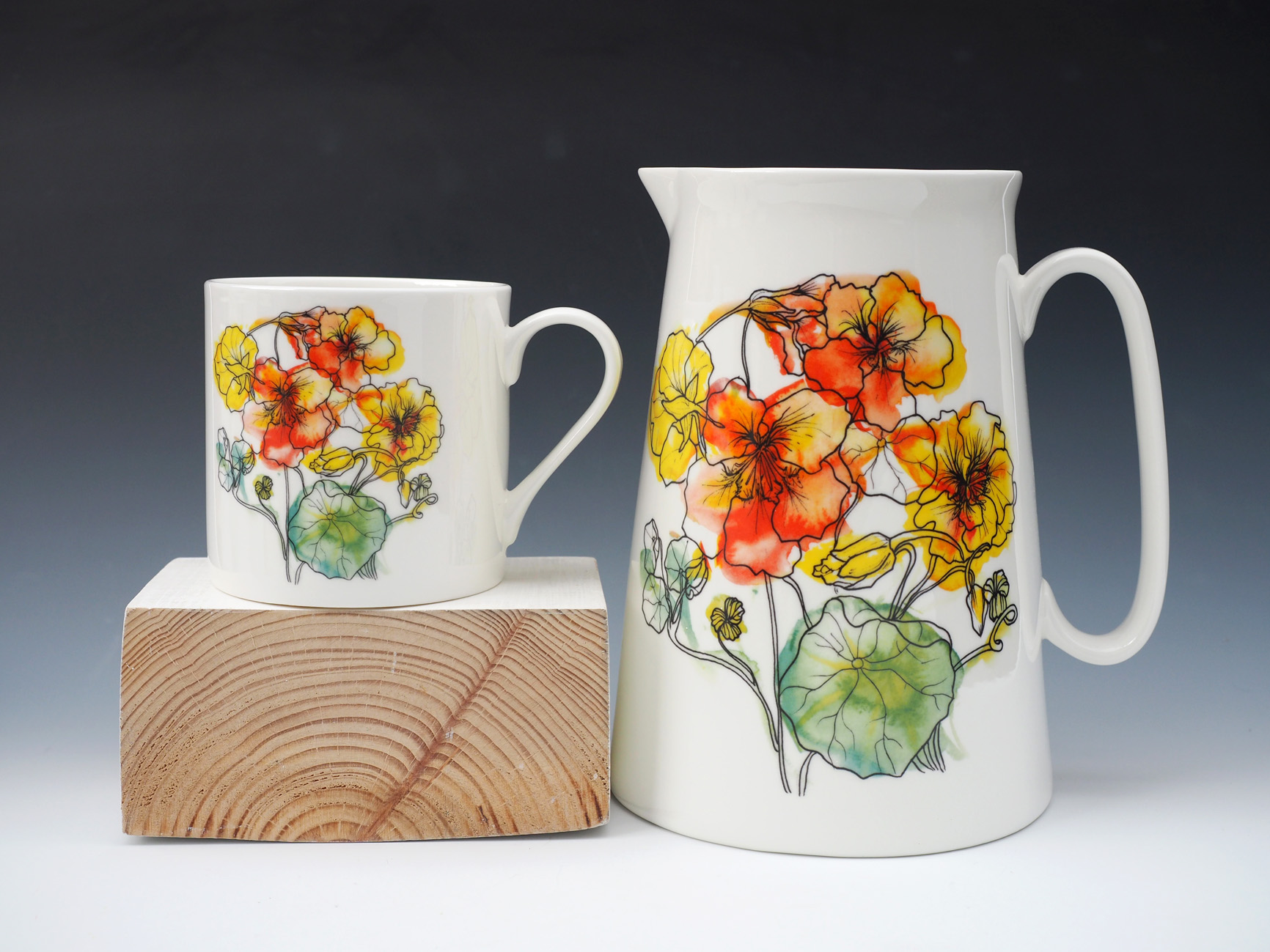
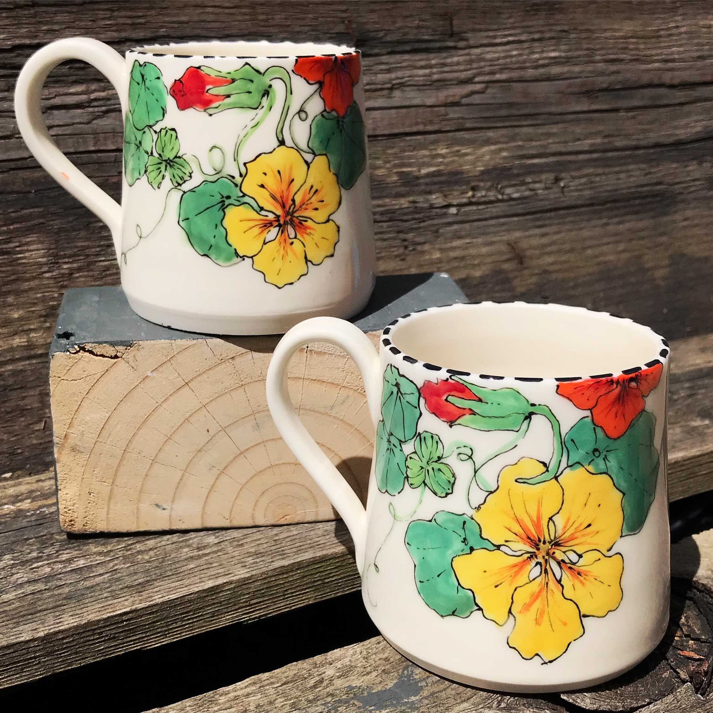
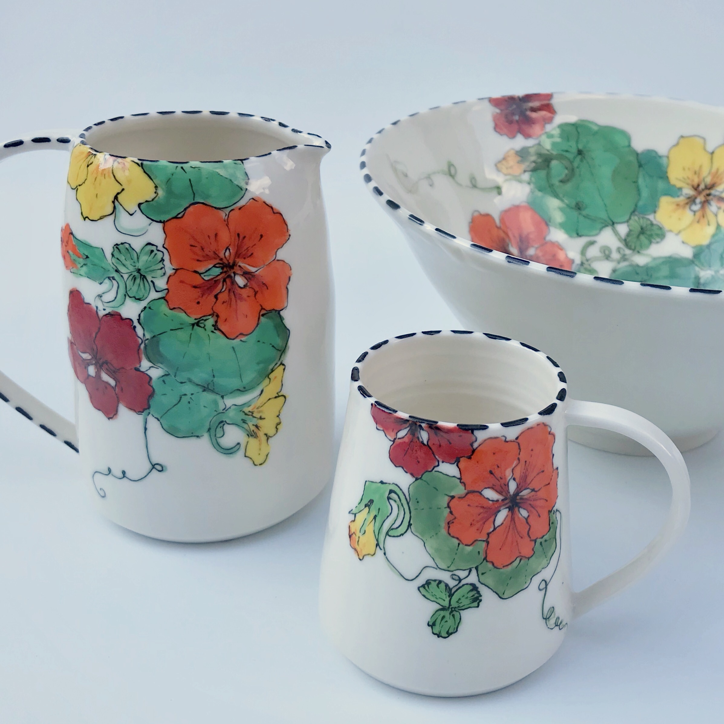
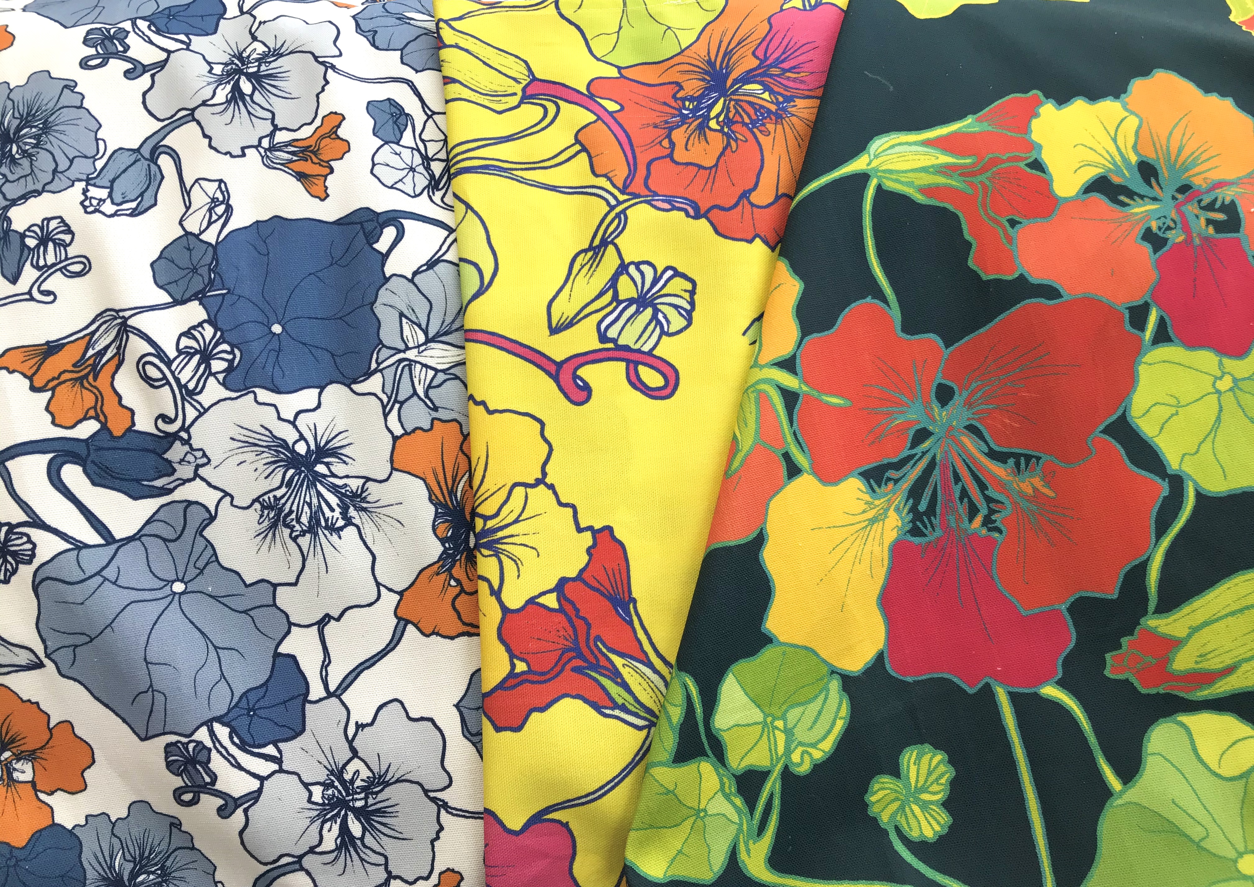
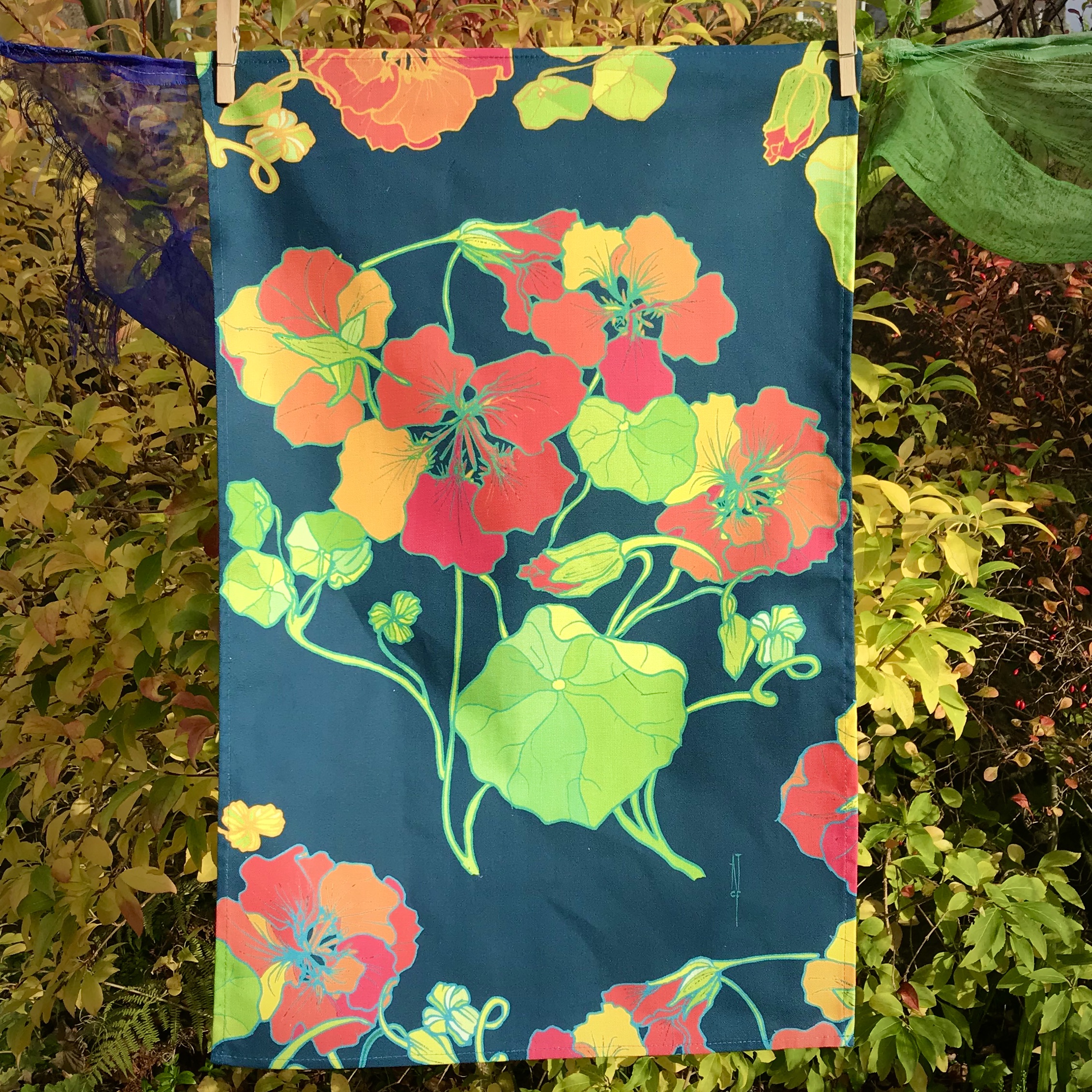
The outcome is so different from the hand thrown ware, and is infinitely quicker to produce which is quite a relief. Popular thought the hand made range is, I don’t produce much of it as it is a very lengthy process with the layered colours and drawing which also makes it quite expensive. I do have a secret admiration for the uniformity of the bone china ware version too! My other major output with the nasturtiums is textile-based: bright, colourful tea towels in three different colourways.

And from the archives here are a couple of shots of my first ever nasturtium designs, produced using the traditional technique of slip decoration with sgraffito (scratching into the clay) to describe the outlines.
Well, Covid19 has put paid to a lot of things…amongst them the regular markets that As the Crows Fly used to attend. But all is not lost! You can visit our new Etsy shop here 😊


It’s also been a summer project of Tea Green events to create a new directory for all their local makers. You can visit it online here.
There are a good selection of ATCF ceramics ranges available, and more and more are gradually being added to the Etsy shop. If you can’t see what you’re looking for it may be sold out – production has been really challenging these last months. Hope you are all keeping well and happy this crazy year!
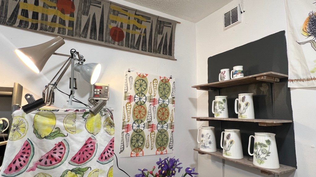
So, it’s been a busy year of upheaval here with As The Crows Fly… I’ve taken the plunge and uprooted from Bristol (where I’ve lived for the past 17 years) and relocated back to my home town in Scotland. It feels good. I’m beginning to meet other fantastic artists and makers and establish a new life here. I’ve been fortunate enough to get a perfect studio space at Fire Station Creative in Dunfermline. It’s vibrant, friendly, professional and *warm*… No more leaky roofs and concrete floors to make winter working so difficult.
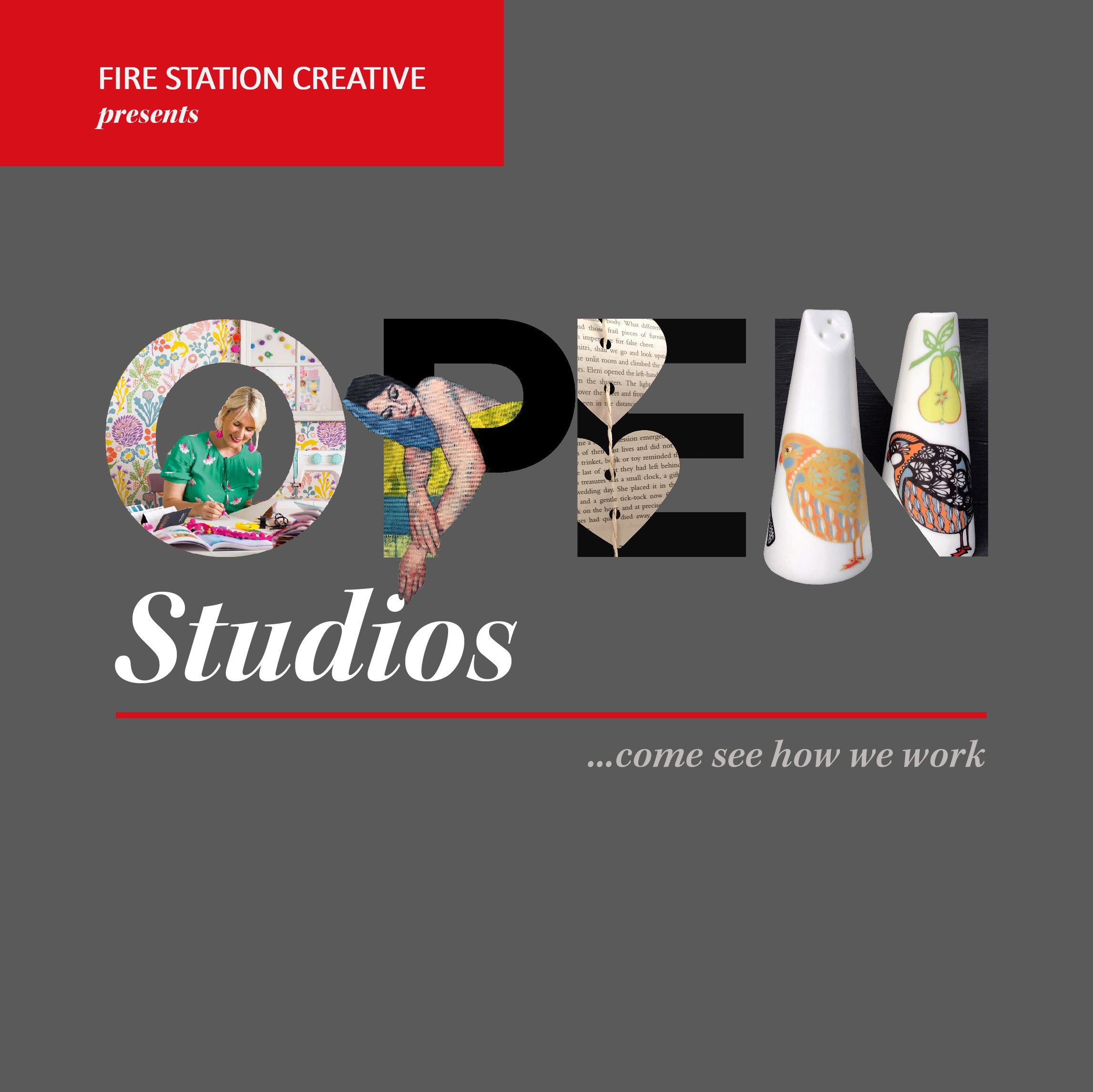
The video at the top of this post was created especially for the event by one of our artists Kelly-Anne Cairns and her son Connor, who have worked really hard to visually profile all the studio residents for this year’s Open Studio event.
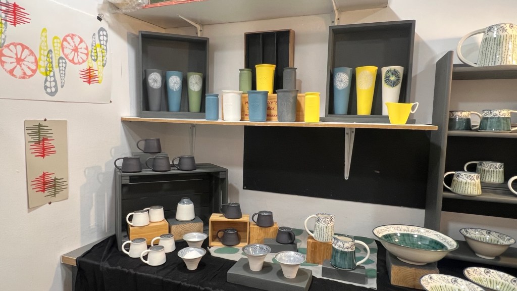
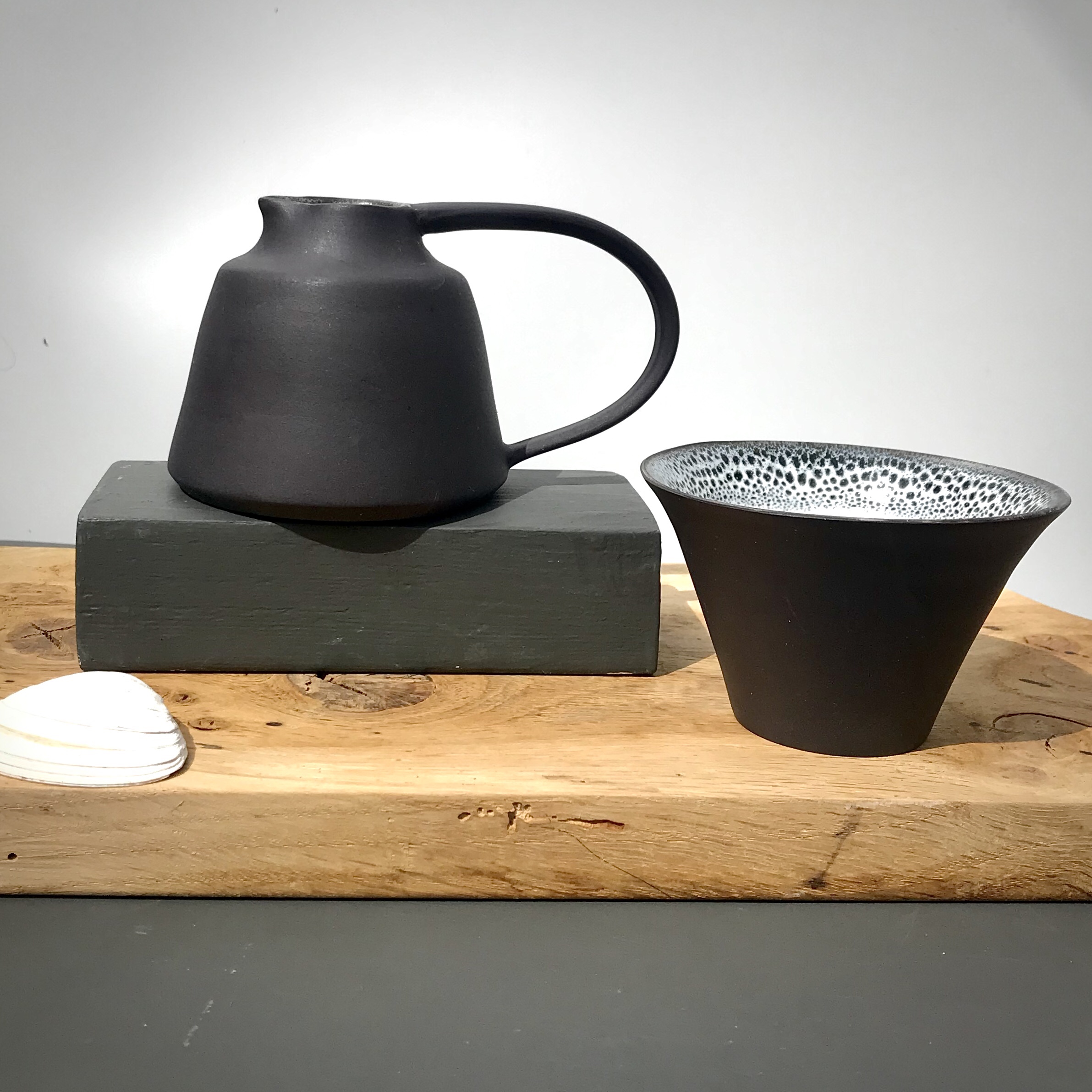
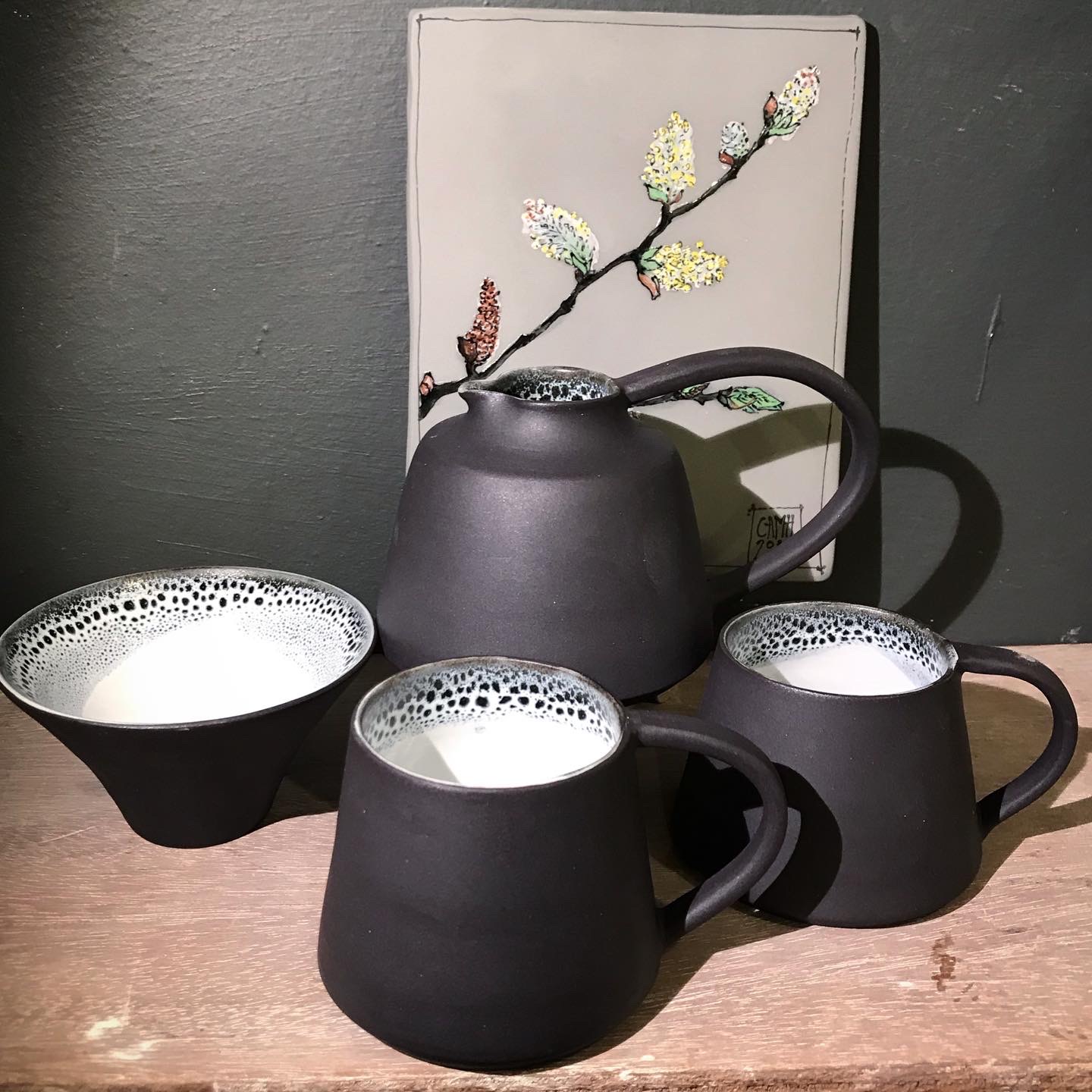
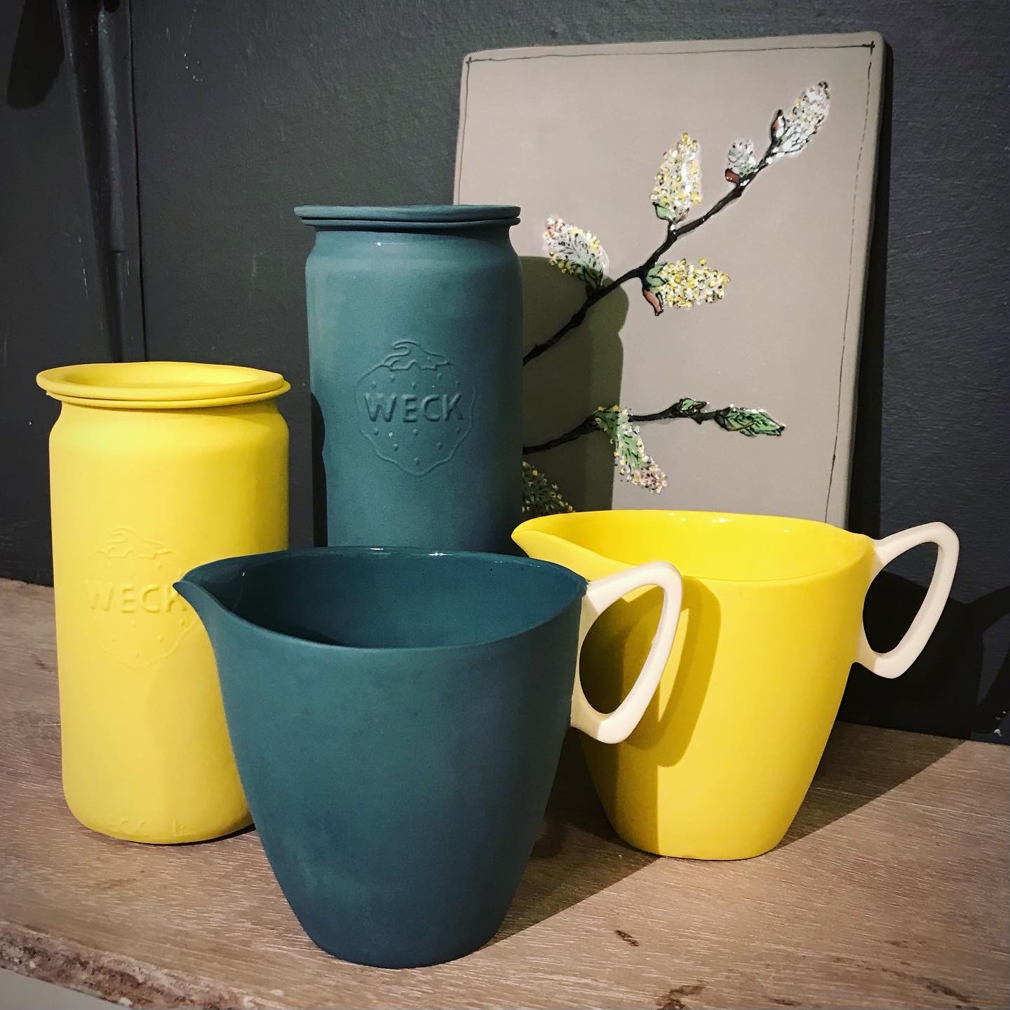
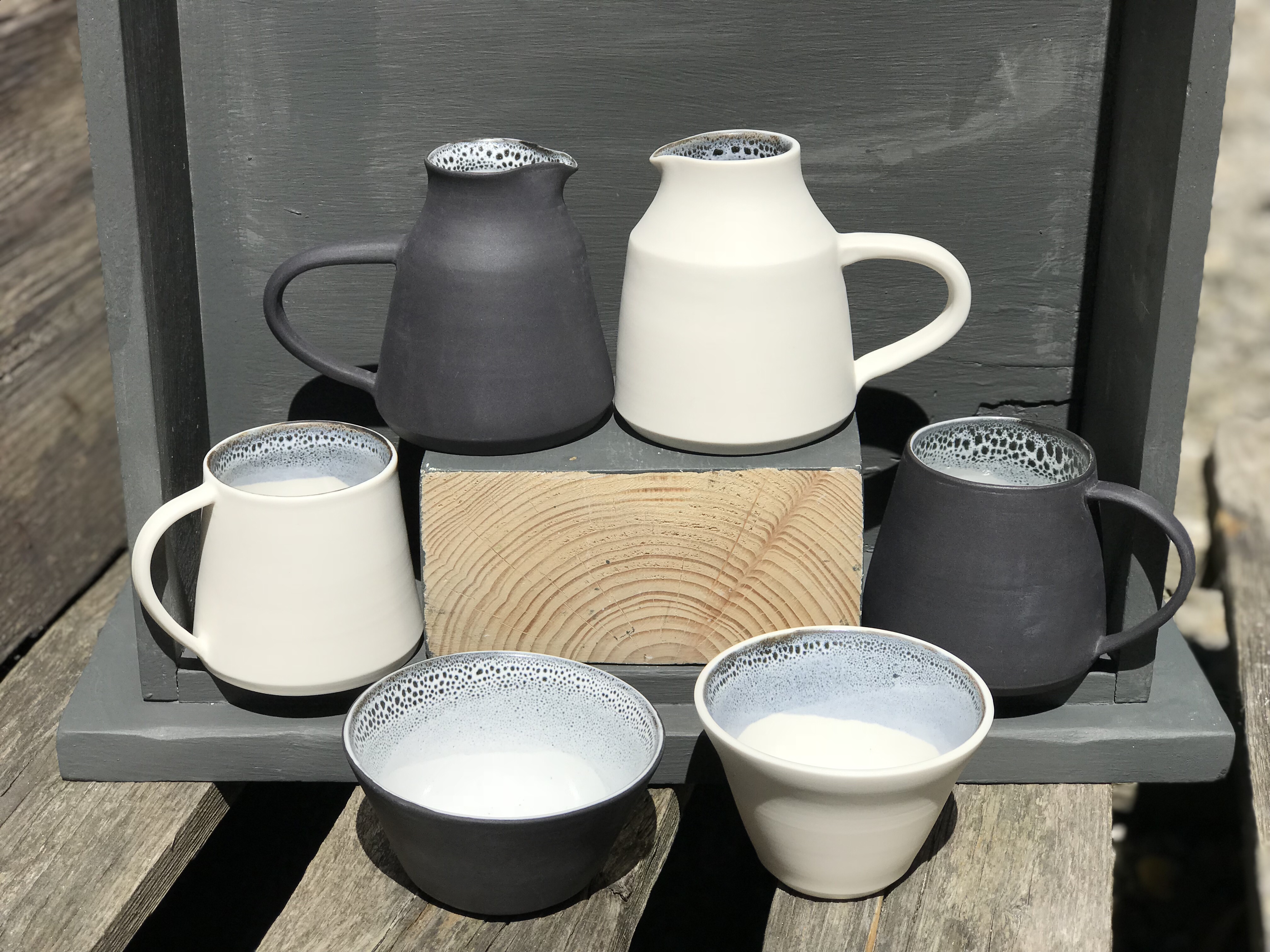
I’ve been working hard developing a new range this year. I wanted to blend the graphic qualities of my slipcast porcelain – bold colour block pieces that rely on the form and design rather than surface decoration – and the handmade individuality of my thrown table ware. Also, from a technical perspective, something I’m constantly learning about in ceramics, I needed to make my volcanic glazed ware more stable in their firings and finally found a combination that works….and so to range building!
I wanted each piece to complement in black and white and finally found a smooth black porcelain body to throw with that I like as much as the white porcelain I use. The surfaces became really important. Each pieces is sanded with three grades of paper after both the bisque and glaze firings to give the outer surface a very smooth and tactile finish. While the interiors invite the eye with their graphic black and white glazing effects. So pleased with them:
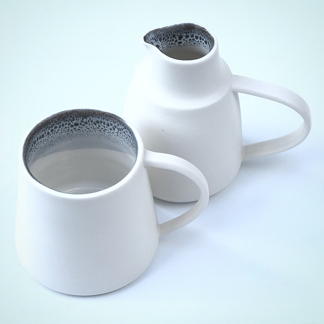
I wanted to create unique pieces with a theme of shape and a feature handle; the jugs remind me of fat pigeons!
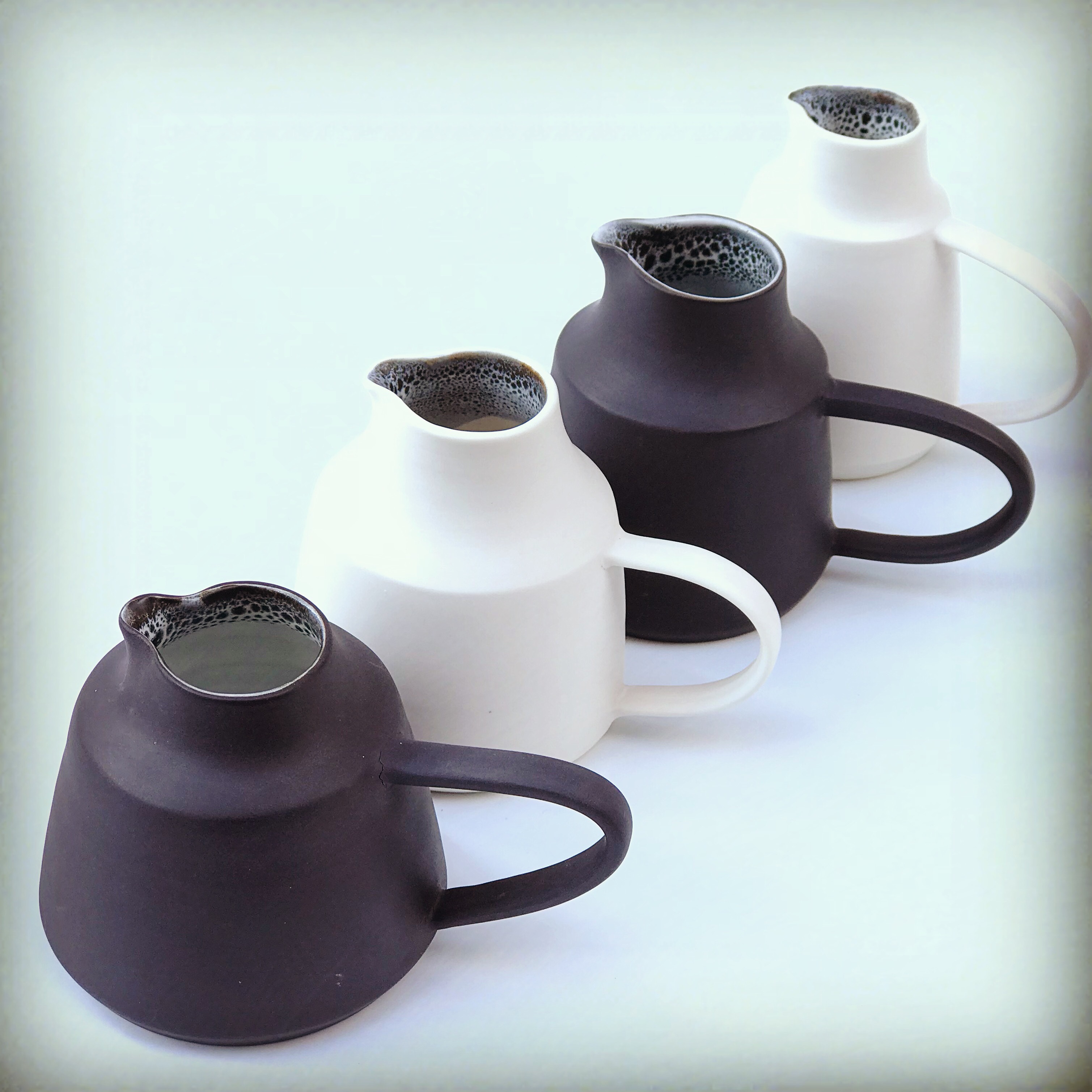
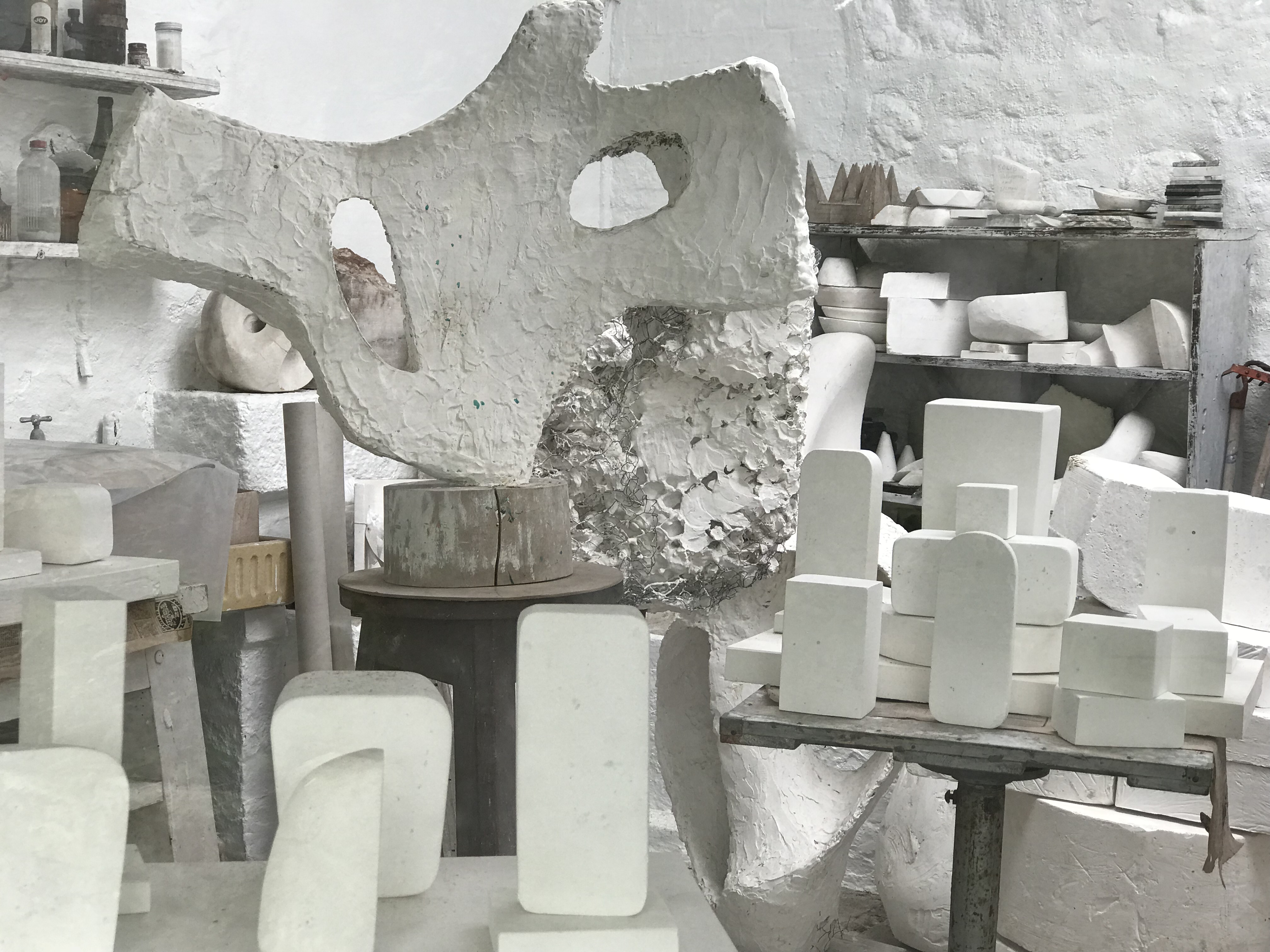
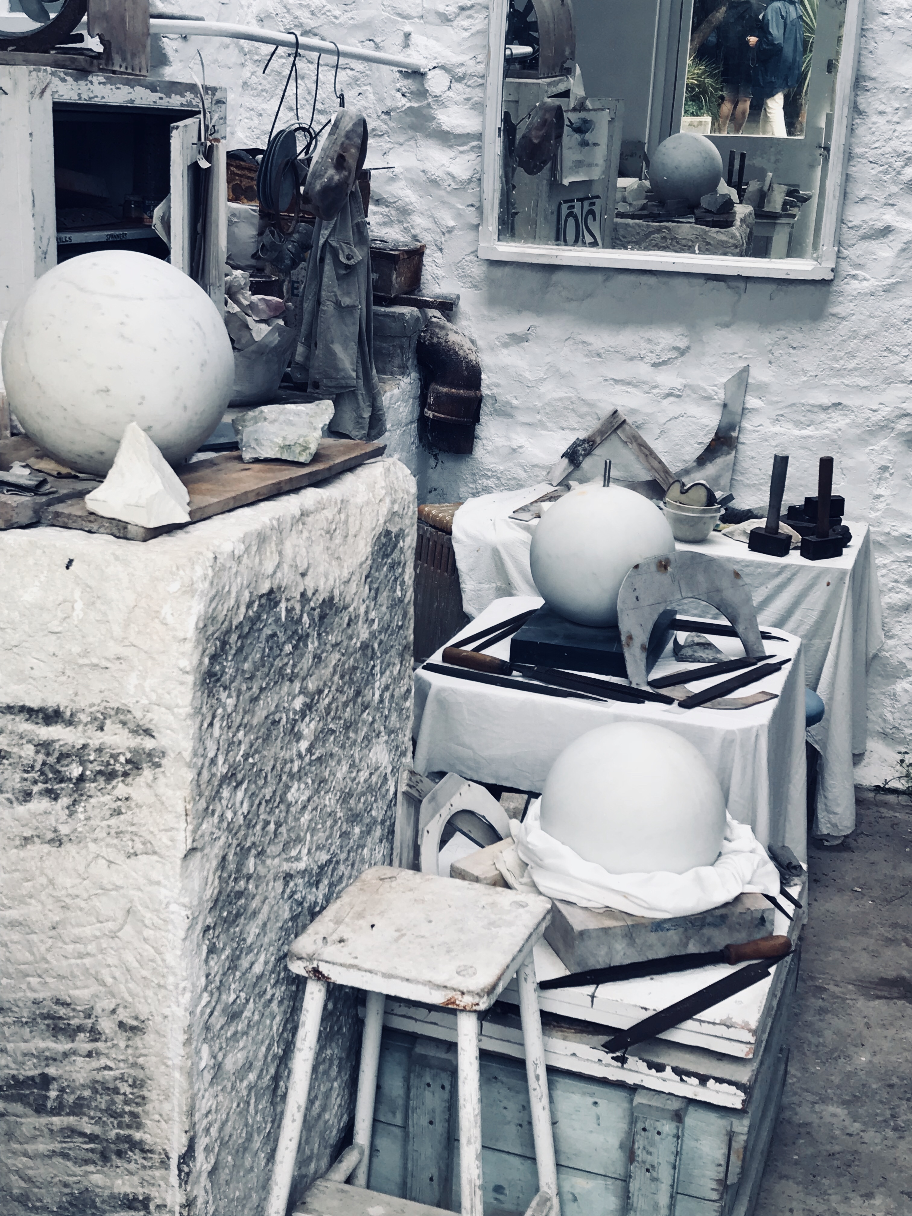
I had a fantastic few days by the coast in St Ives during summer and immersed myself in the amazing art that’s on tap there – Barbara Hepworth’s studio was awesome. Incredible combinations of form and texture in a monochrome palette. So inspiring for this range of work…
I’ve trialled the capsule range now at a few markets and I’m really pleased with how it’s turned out and the positive response from clients. It’s very simple: espresso mugs with sugar bowls and creamer jugs. A set of ceramics designed to create the perfect coffee moment.
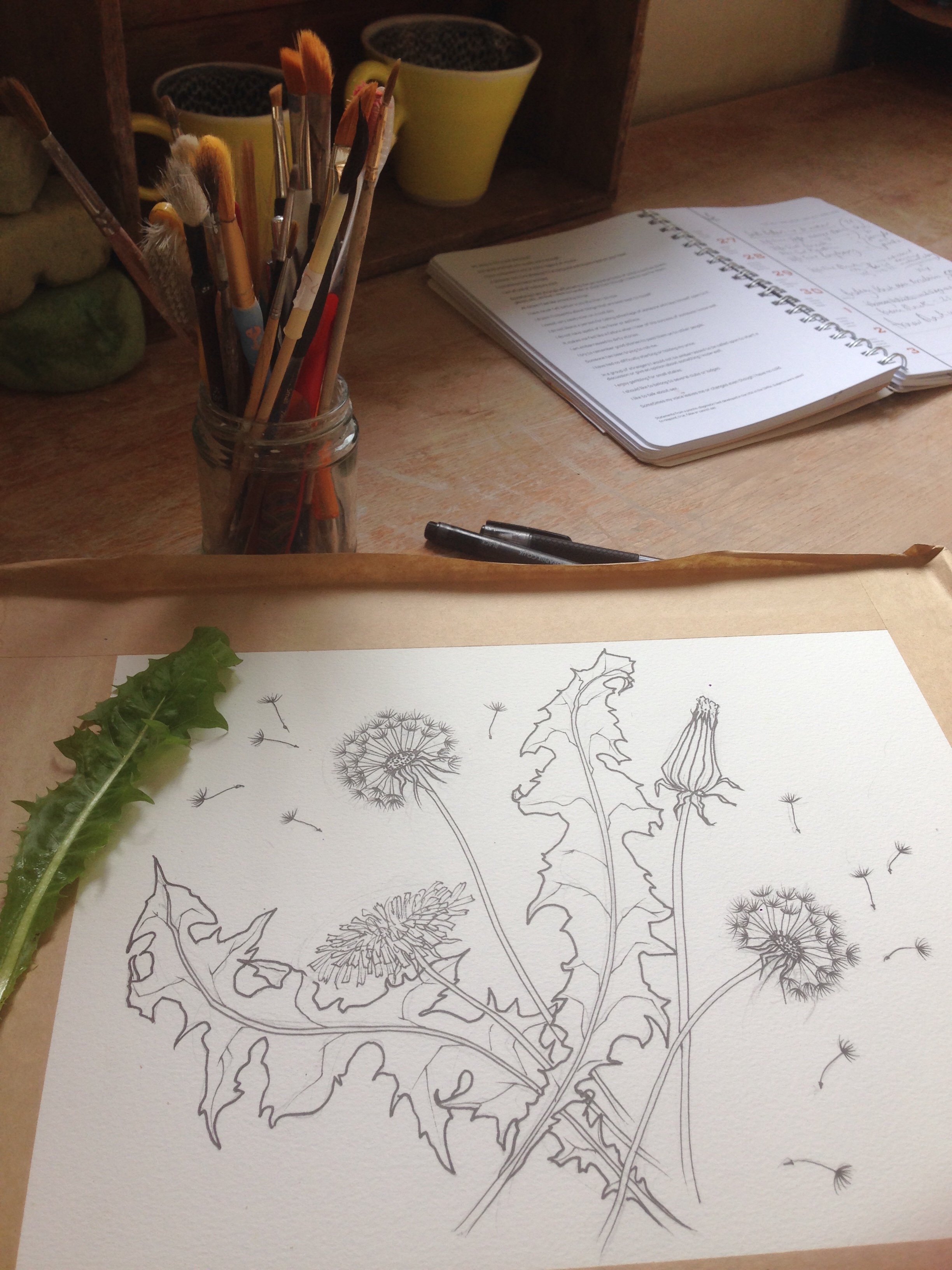
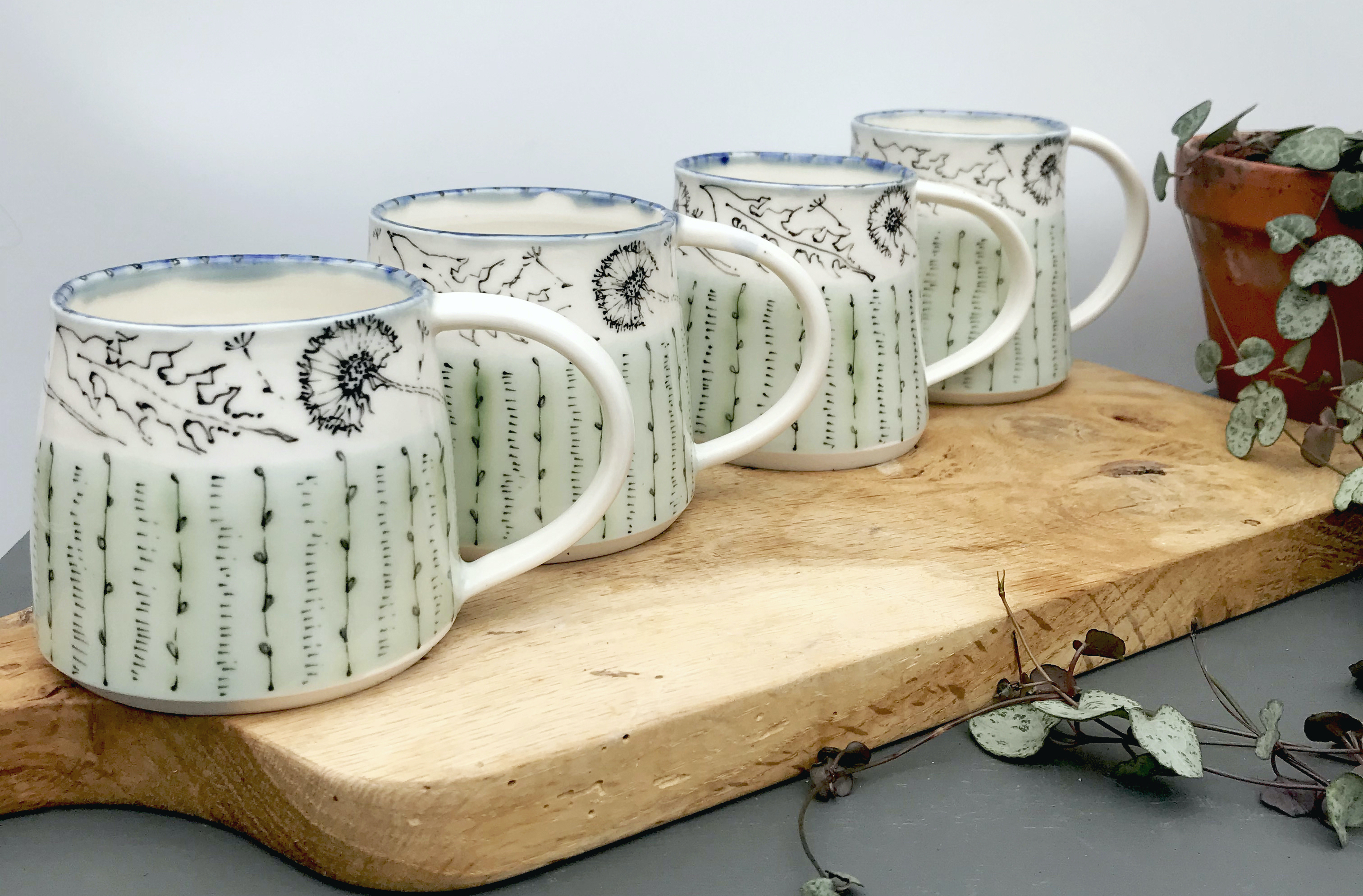
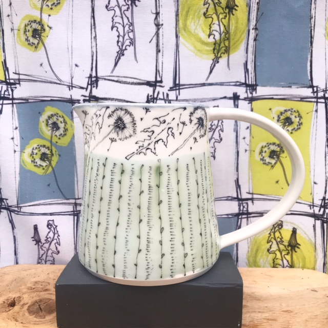
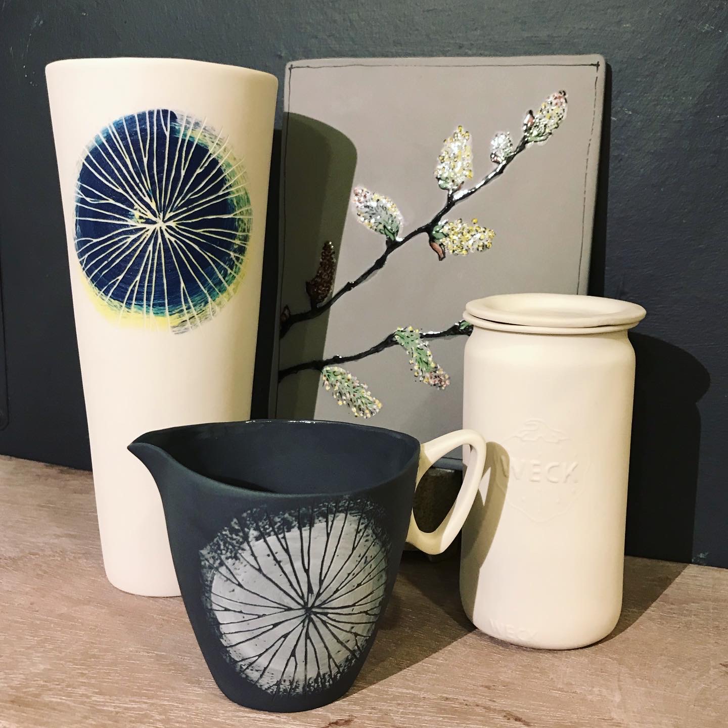
There’s a story here…I’m not entirely sure what. But I do have an endless fascination with the humble dandelion. I was reminded of it’s beginning when a friend in Germany sent me a photo of her morning coffee in one of my terracotta sgraffito mugs – the range I began my ceramics business with.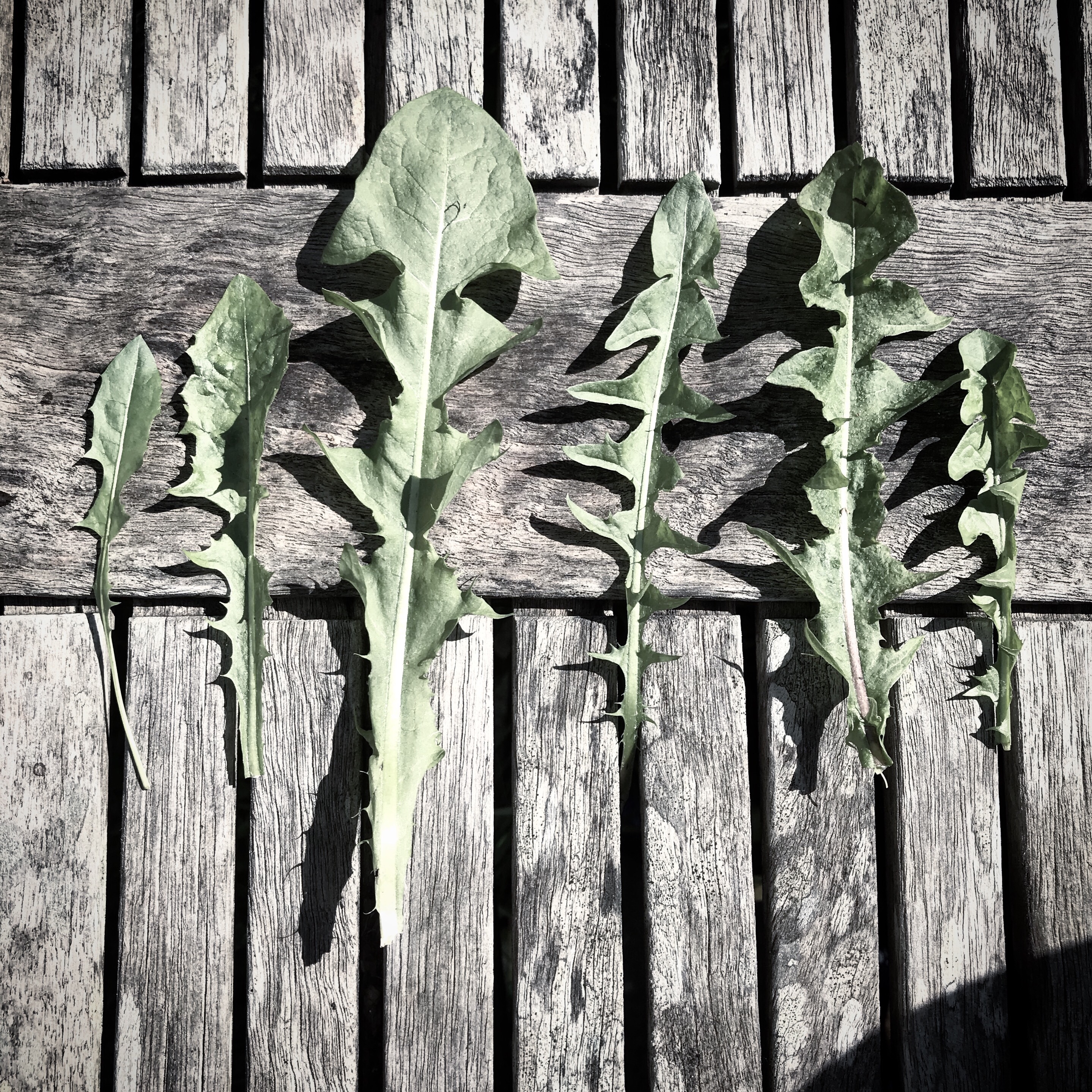
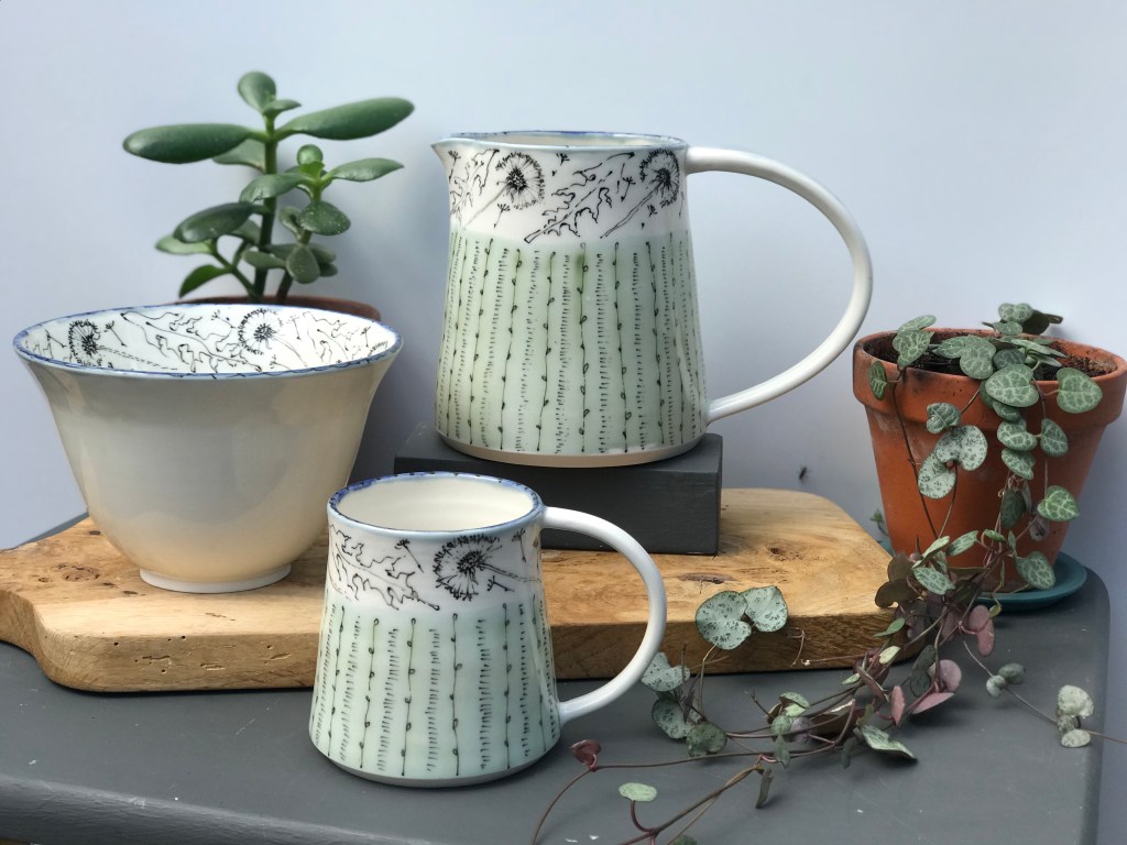
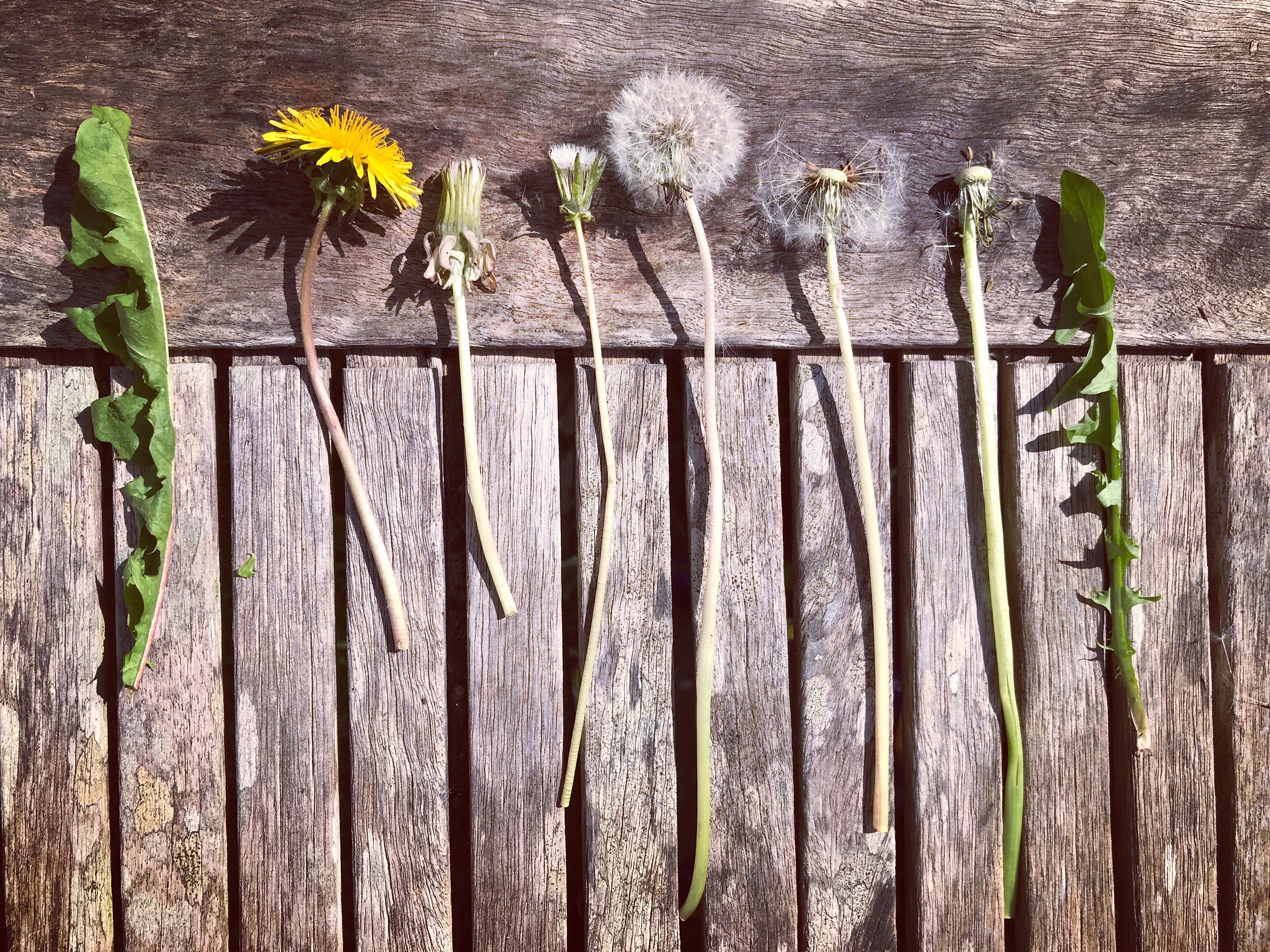 I recently photographed a new selection of dandelion specimens just to remind my drawing brain what they really look like after a winter of illustrating from memory. I only throw and illustrate porcelain now – a very different look from my earthy terracotta pieces. The dandelion lends itself just as well though and, despite the hand cramps, I never tire of drawing it…
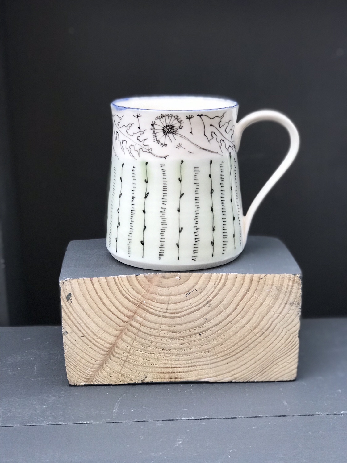 I also produce fine bone china wares – firing my illustrations on to ready made pieces instead of creating each vessel from scratch. It’s a different feel and I like the utilitarian uniformity and perfection it gives the pieces. It also means I can produce matching tea towels – a source of great satisfaction to me. Some artists relish the giclee print and the framed work but I love the idea of my designs finding their way into my favourite room in the house, the nurturing kitchen at its heart.
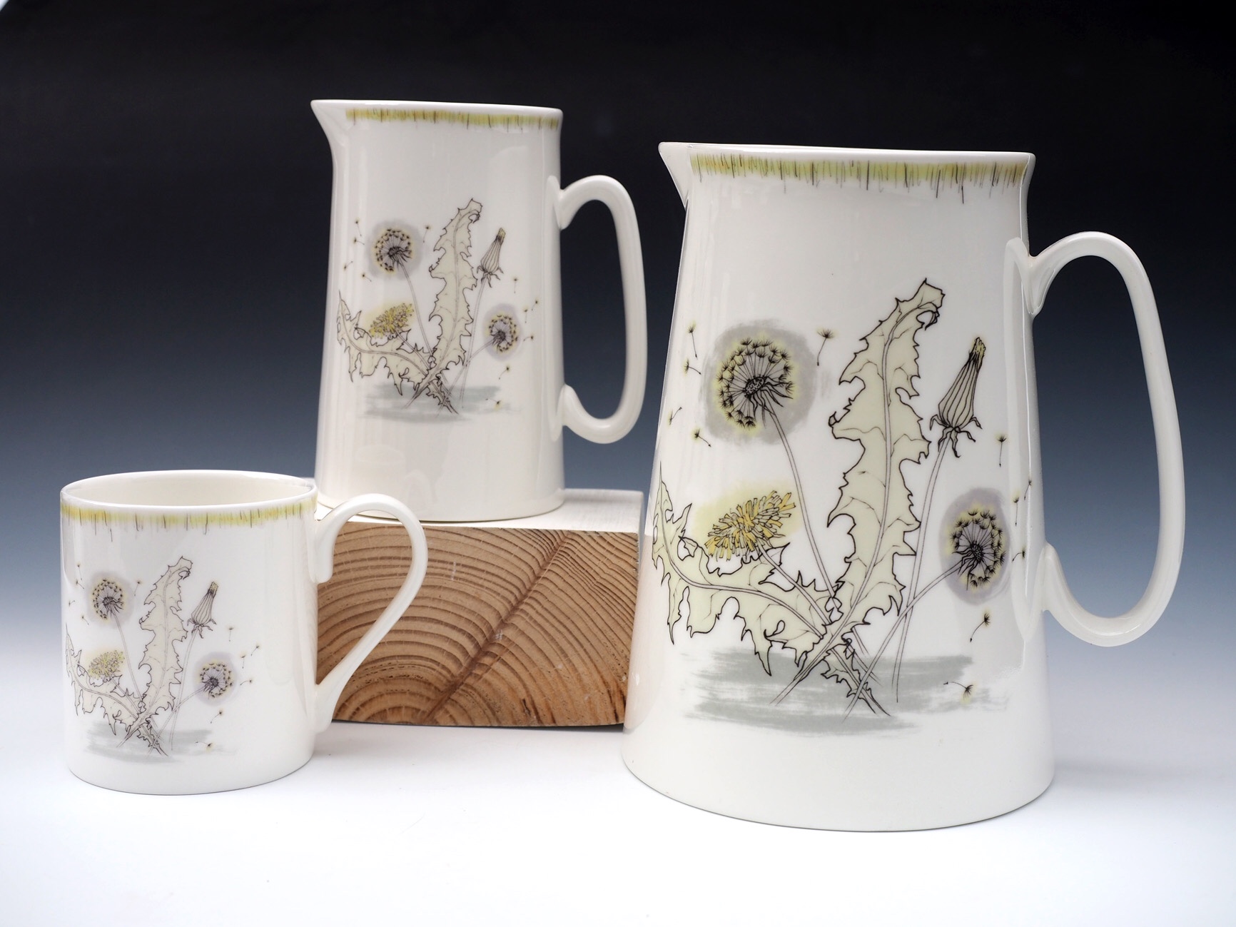
 Above you can see slip and sgraffito decorated earthenware mugs in dandelion thistle – I no longer make them but a client commissioned them to add to their collection of this work. My first dandelion tea towel is shown below with a 50s colours and feel. I’ve updated the design for 2018 in fresh slate and citrine on white, increasing the scratchy mid century modern look. It’s pictured at the top of this post.
 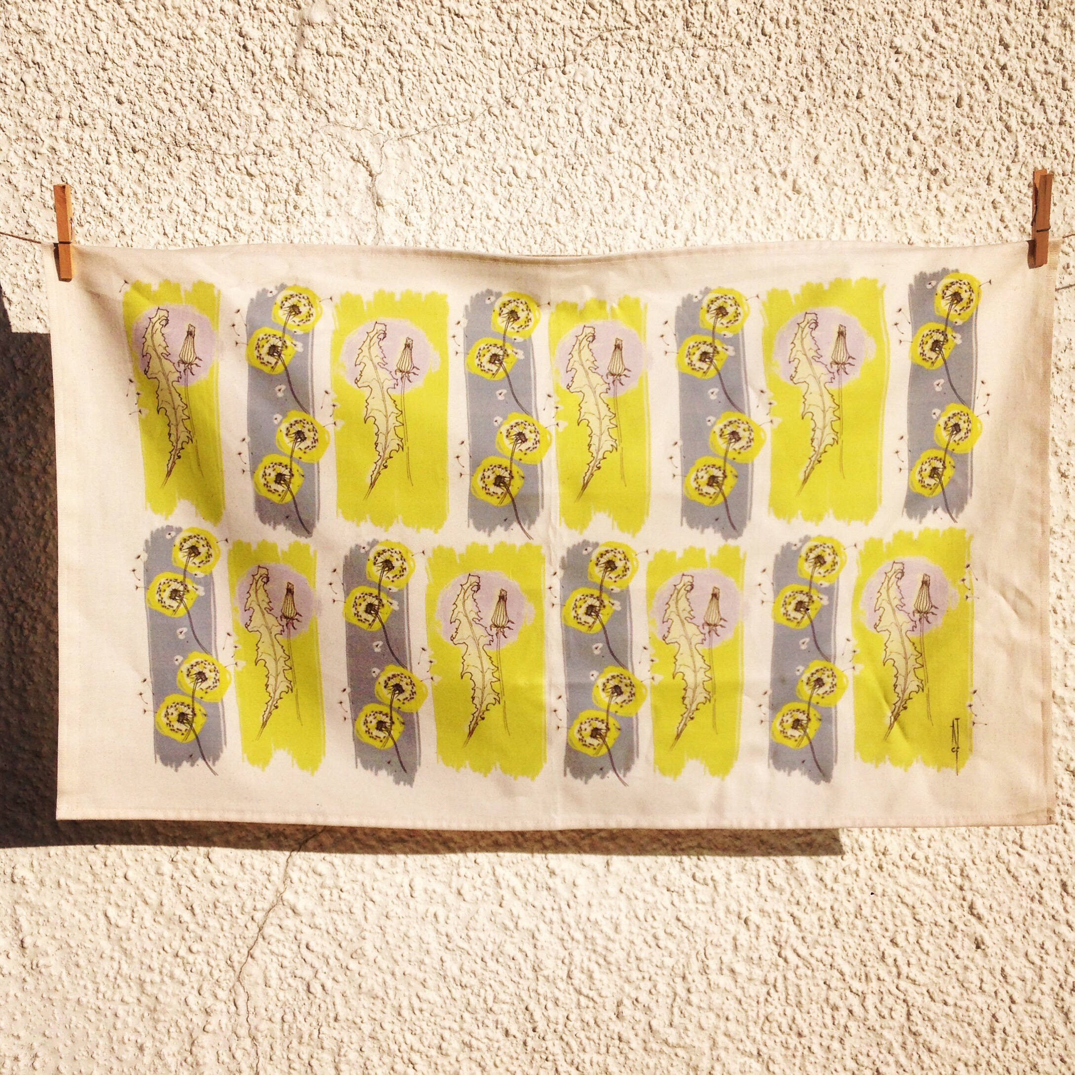 Below is an alternative dandelion bone chinaware motif – again it has a mid-century feel with ochre highlights this time.
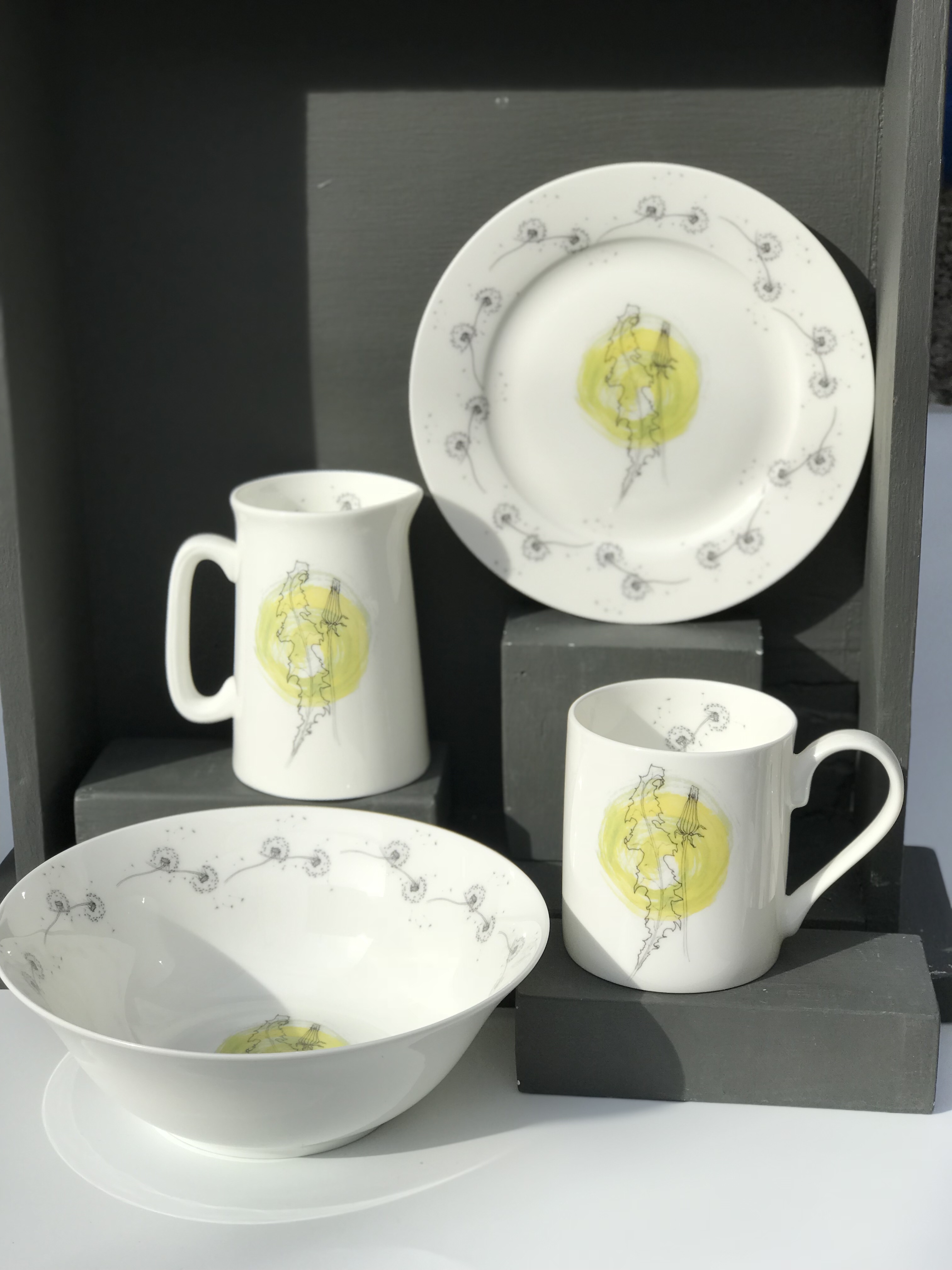
 Everything starts with pen and paper and botanical specimens for me – I love the rigour of drawing from life and trying to catch botanicals in the best season. One day I’ll manage to get my sketchbook out before the Forsythia flowers wither and fall…